| Posted By | Message |
|

myrke
Posts: 813
Joined: Aug 2020
|
| Tuesday, August 3, 2021 5:25 AM | |
I like both designs and definitely don't have a problem with that yellow. In this age where many base cards are a whole lot of hohum, I'll take '91 Fleer boldness any day.
|
|
|
|
|

ComposerMike
Posts: 809
Joined: Aug 2020
|
| Tuesday, August 3, 2021 9:00 AM | |
Take away the large amount of solid color (which is the main eyesore) and you have some pretty amazing photography. For me it's the shade of yellow - no one complains as much regarding the blue border of 1986 Fleer. Perhaps they could have toned down the color and added a slight texture.
-------------------------------
Please visit my YouTube channel 'The Vintage Composer' for more info on sports card collecting, sports history, trivia, and more! https://www.youtube.com/channel/UCPoAYGOXYlY9OBIZPKqsCgA/videos |
|
|
|
|

Jgamble
Posts: 220
Joined: Oct 2017
|
| Tuesday, August 3, 2021 9:40 AM | |
Yes, that was a consideration. I tried a subtler yellow that recalled aged paper, (and I think there are some versions out there that are white backgrounds?) but the 90s eschewed vintage and were all about obnoxious colors.
-------------------------------
Cards come from a smoke/pet/Subway-bread/patchouli free home. |
|
|
|
|

Staff23
Posts: 22
Joined: Apr 2017
|
| Tuesday, August 3, 2021 9:46 AM | |

91 fleer has a special place in my heart as I collected almost the whole set from the wawa down the street from our beach house that we used to go to every summer. It was the last year we went to that house so there were a lot of memories and it seems to have culminated into the 91 fleer set. LOL
But here's a version my buddy did in black.
|
|
|
|
|
andersonadams1
Posts: 45
Joined: Mar 2020
|
| Tuesday, August 3, 2021 9:57 AM | |
That looks similar to 93 Pinnacle which is one of my favorite sets of the 90s.
|
|
|
|
|
Jgamble
Posts: 220
Joined: Oct 2017
|
| Tuesday, August 3, 2021 10:22 AM | |
That's sharp looking in black.
-------------------------------
Cards come from a smoke/pet/Subway-bread/patchouli free home. |
|
|
|
|

vrooomed
Posts: 15,042
Joined: Dec 2012
|
| Tuesday, August 3, 2021 10:29 AM | |
-------------------------------
-- Dan -- Note: Please see my profile for more info regarding trading (section updated 3/4/2024). I have added a large portion of my inventory to the site, and currently have trading turned on (details are in my profile). |
|
|
|
|

ohoffm
Posts: 190
Joined: Nov 2020
|
| Tuesday, August 3, 2021 12:51 PM | |
I really like the charcoal/black borders and the all star and provisions I always liked. I guess I am not a fan of the yellow.
|
|
|
|
|

Sportzcommish
Posts: 6,035
Joined: Oct 2016
|
| Tuesday, August 3, 2021 1:21 PM | |
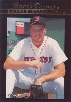
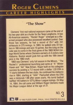
Prefer the black, but it looks like Fleer did something similar to the Mattingly when they produced the Clemens inserts the following year in 1992:
-------------------------------
Follow my blog - I Identify as a Card Collector. “Aslan didn't tell Pole what would happen. He only told her what to do. That fellow will be the death of us once he's up, I shouldn't wonder. But that doesn't let us off following the signs.” - Puddleglum in The Silver Chair by C. S. Lewis |
|
|
|
|

cardcollector65jw
Posts: 1,256
Joined: Nov 2019
|
| Tuesday, August 3, 2021 1:29 PM | |
Changing the lettering really helps the crazy of the yellow.
-------------------------------
When life has you down buy a pack of cards and realize you overpaid. |
|
|
|


")