So, I have always been a stickler for good and bad card designs of Topps flagship. After all, Topps flagship is called flagship for a reason -- it is the old faithful that sets the tone for baseball card collectors for that season. So, I've decided to make a new post every few days rating every topps baseball design ever, one decade at a time, along with 4 awards for each decade:
1. Best overall design 2. Worst overall design 3. Most underrated design 4. Most overrated design
Here is the rating scale I am using:
1 - Gross, awful looking design that would be bad even if it were an unlicensed product made by a random 3rd party "company"
3 - Would not have to plug my nose to collect, but not a pretty design by any means.
5 - "Average" but I would call it the "meh" rating. Nothing stands out, but there are no glaring issues either. Its just a, well, "meh" addition.
7 - This is a solid design -- one that will stick in your mind as definitively a good Topps Design even if you didn't collect that set as a kid.
9 - A classic design. Beautiful, clean looking cards that are great in almost every single way.
10 - A legendary design. This is one where even non-collectors will look at it and say "Wow, that is a dropdead gorgeous card."
Obviously, this is just my own personal opinion, so feel free to chime in where you agree or disagree with my thoughts. With nothing better ado, lets get into it!
1952 Topps:
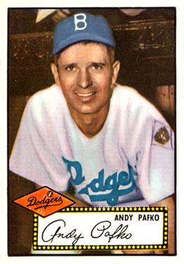
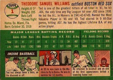
One theme you will see with both the 1950s and 1960s is that nearly every design Topps introduced was at least good. Topps first true flagship set is no exception. However, I feel that in a vacuum, 1952 Topps is overrated simply because it is the first set. Sure, it deserves bonus points since it basically was the one that standardized what a baseball card should look like and introduced a HUGE feature of having stats on the back, but ignoring that, the design is rather boring. I am not a fan of the facsimile autograph, frankly. It takes up too much space with a big white box -- especially considering the printed name is right above it and the complete lack of any other vital information (printed team name? position?). The painted photograph of the player though, is majestic! (Common theme for the next few designs). The back of the card is legendary. Can a first card back possibly look any better? Frankly I don't think so. I will be typically rating based more on the front design since the back is usually taken up more by the stats, but if the back is excellent it will receive some bonus points, and that is definitely the case here.
Rating: 7/10 Topps entry into the flagship series is a solid start, aided by a fantastic reverse design and beautiful color photographs. Too much space is taken up by the white box though to make it flawless.
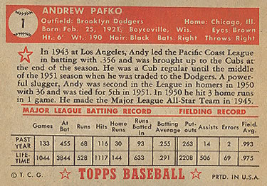
1953 Topps:

H O L Y C R A P! As I saw it described once before, every single '53 Topps card belongs in a museum. How did Topps fix the big white box problem? By stuffing more information into it, coloring the box in based on the player's league, and making it look extremely clean. The card front is the easiest 10 I will be handing out, and might be the best design of all-time. It is at least top 5. The card back is vertical this season, which any collector of Topps will tell you is unusual. It is plain to see why Topps quickly decided against vertical designs. The stats table on these cards is not nearly as clean as '52 or future horizontal Topps designs. But they do get bonus points for the introduction of cartoons and trivia questions (even despite them being too big). I'll add that I love the facsimile autograph being over the player bio on the back, but not too much in the way to be a hinderance. Brilliant move by Topps there, and that is how a facsimile auto should be dealt with if you absolutely must put in on a card.
Rating: 10/10 The card front is drop-dead gorgeous. The back isn't as strong as '52, but credit Topps for experimenting with something new, especially in only their second year. They get a pass for that.
1954 Topps:
Topps did away with the player name boxes for now and instead just put the player name on the top, which is fine, but not as clean as the '53 design. Still, there is nothing wrong with it. One thing this set did that I don't believe any other Topps set has done since is have no border on only one edge -- the top. And, suprisingly, it looks absolutely amazing! I don't know how or why, but it works. Another thing I love is that Topps took advantage of every bit of extra space they had on the card this year (remember the cards were larger from 1952-1956), and they continued this trend until the cards were reduced in size to today's standard. The card back is, simply put, perfect. Lots of color, a clean looking stats table, and my goodness why does the bio information look so darn good? I think this is my personal favorite reverse. However, the card front isn't all perfect. I like the two player images (its not perfect -- they would perfect it over the next two seasons), but the facsimile autograph just randomly strewn on there. Meh, not a fan.
Rating: 8.5/10 The front is a solid 1950s entry for Topps. It actually ins't very clean, but I love that they experimented with the two-image look and, in general, it works. It just isn't the best of the decade. However, '54 gets a big-time bonus for it's perfect reverse. It is stunning. If you combined the '53 front with the '54 back, you would have the greatest looking baseball cards of all time.
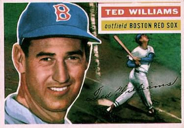
1955 Topps:
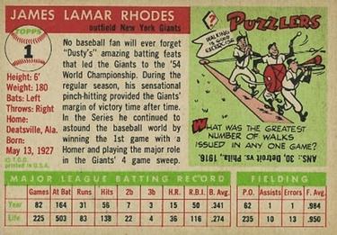
Topps decided to go all horizontal with the card fronts this season, and I am here for it! This was a very smart decision because now the two-image design on the front looks so much cleaner. Fantastic idea! The name box is back as well, which adds to the color and clean-looking card front. It is a very nice looking set. The card back, while not on the level as '54, is still awesome! I'm still not a fan of the facsimile autograph and, while I know these served the purpose of fans trying to determine whehter autographs were genuine, it just feel like there is a better way of presenting it (see 1971 and 1953).
Rating: 8.5/10 See '54 for pretty much all of my points except this design has a slightly better-looking front, and slightly weaker reverse.
1956 Topps:
The purely horizontal design returns, and also marks the end of the larger card era, and the last of the three year run of two-image deisigns, and boy oh boy did they ever perfect it. It was kind of cool as I was doing my analysis of these designs seeing the natural progression and improvement of similar designs year-by-year. This season, I would give the card front a 10 -- whoever's idea it was to use an action shot as the second image deserved a humungous raise (65 years ago haha). This is without question the second best looking card front of the '50s, and I would also put it top 5 all-time. It is absolutely perfect (except for the facsimile auto, which I am willing to overlook this year). Also, the attention to detail to put the face shot on the opposite side of the name and team box and the action shot slightly smaller in order to fit nicely under that box. YES YES YES!!! I wish I was a kid collecting back in the day just so I could unwrap these beauties. Ironically, while the card front improved over the previous three seasons, I feel like the reverse got slightly worse over those three years. To be clear, it is not at all bad, and it was a cool idea to basically have the players' bios be in cartoon form, but it doesn't quite do it for me. It feels too busy.
Rating: 9.5/10 I love this design, and the only thing preventing it from being a 10 is the slightly busy reverse. Beyond that, perfect!
1957 Topps:
This marked a new era for Topps designs. The two-image fronts were abondoned, probably due to the more important change -- the decrease in size to the now standard 2 1/2 x 3 1/2. As a result, I believe the front suffers a bit of a decrease in quality from previous years, but suprisingly not too much because of another introduction from Topps -- full color photographs. Granted, Topps had been fiddling with actual photos for the previous 3 years (and was hand-tinting them, according to Wikipedia). But this is first time they used unfiltered, clear color photos. And while not flashy, the name and team location and the decision to not use a box is actually a great decision. They decided to really emphasize the photos this year, and I love it! I used to believe this was the worst looking set of the '50s because it was the most "boring," but honestly, the older I've gotten, the more I appreciate the design. I haven't even gotten to the back yet. How on earth did Topps find a way to put complete, year-by-year stats on the back for the first time, with a smaller card? Brilliant innovation once again from the early days of Topps. Now, granted, it is not as flashy as some of the previous backs. There is less color and there are no fun cartoons, but frankly, I don't care. Its clean, and looks aesthetically great.
Rating: 8/10 This is not quite to the level of a "classic" Topps design, but it is certainly more than a solid entry. The number of innovations that Topps introduced in just one year, while also still producing a very strong and good-looking entry, is honestly amazing.
1958 Topps:
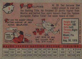
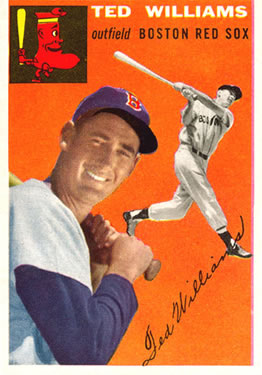
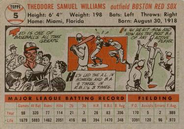
(Why is Ted Williams card #1 in like every set?) In my opinion, this is the weakest design of the 1950s, which is not saying much because all of them are at least above average to solid. But still, after a number of things that were introduced in '57, you'd really hope that Topps would improve upon them the following year (similar to how '55 and '56 built on the prior year). That is not what happened. Topps went back to the full colored-in background, which to be clear does not look bad, and it is probably better for kids. But it feels a bit like a let down after we got full photographs of the players in '57. There are other elements I'm not crazy about on the front. First, the team logo just kind of looks tacked on, and I'm not even sure if it is necessary. It messes with the centering of the photo. Second, the player name at the top, again, just looks like it is floating. I am not usually a fan of floating text ('57 being an exception), and that applies here. Worse, the reverse, just one year after introducing year-by-year stats, a humungous innovation, kind of takes a step back in my opinion. I like the bio box, and it is nice to see the cartoons again, but I think the full statistics are better than both -- just my personal opinion. If they are marketing the cards to kids (which they were back in the day), then I really cannot fault them for this decision, so I won't penalize them too hard for that one.
Rating: 6/10 It really says something about how amazing the early Topps designs are when the first decade's worst design is still above-average.
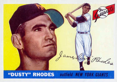
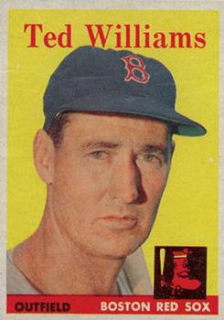
1959 Topps:
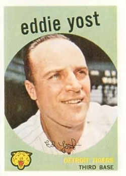
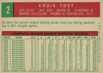
This design was literally a combination of '57 and '58, and it works very, very well! Switching it up and talking about the reverse first, it is essentially the '57 design, except better. It has more color and the nice big card number right next the the bio box which are perfectly sized and with a perfect color combination -- that is God tier work right there. But, I want to talk a bit more about the front. This design feels very experimental in nature. It was almost like there was an internal struggle where three people at Topps were arguing. Employee one says they should utilize the full photographs again like '57, employee two says they need to have more color on the card to draw kids in. Employee three says, "why not both?" And that's exactly what they did. the circular image is a first (and a last), but it works very well. But what I absolutely adore is that they take advantage of the extra space around the circular image perfectly. A circle is an abnormal shape to see on rectangular cards, and it leaves some weird dimensions of space for the rest of the design. Topps made the brilliant choice to use the bottom spaces with the team, position on one side and the logo on the other, but left more space on the top for a fun, almost wonky like text at the top, but it works, This is dictionary definition classic Topps design that should be remembered fondly.
Rating: 9/10 This was an experimental design that combined the good elements of '57 and '58 nearly perfectly and made great use of the space on the card it had. The reverse was simply an upgrade of the '57 design, which is not a bad thing.
Awards:
Best overall design: 1953 Topps -- The three designs in the running were '53, '54, and '56. '53 had the tied for best front with a weak reverse, '54 had the best reverse, and '56 had the tied for best front but a weak reverse. However, I have to give the nod to '53 since this was only Topps' second year, and the reverse felt much more experimental, as if they were still trying to figure out what worked. By '56, Topps had already I believe perfected the reverse in '54 and to a lesser extent '55, so there was less of an excuse. '54's reverse was jaw-dropping, but the relatively sloppy front (at least when compared to '55 and '56) have it fall short of '53.
Worst overall design: 1958 Topps
Most overrated design: 1952 Topps -- I already discussed this a bit in the 1952 Topps section. I believe it is a bit overrated simply due to it being the first set with some of the most valuable and sought-after cards in the hobby. It is not a bad design by any means, especially given that the design was literally drawn on a napkin in the kitchen one night. But still, in a vacuum in which we disregard that context when compared to the rest of the entries from the '50s, it doesn't hold up as well.
Most underrated design: 1957 Topps -- I don't know if I was the only one who thought this, but it just feels like there is less hype surrounding the '57 design compared to the others of the decade. It is the only one in the '50s to not have such colorful backgrounds, so I think it gets overlooked. This is especially true given the context that they managed to fit so much more player information on the card in a year when they shrunk the card to the now standard size (which is another conversation in its own right). I appreciate this set so much more now than I did before for that reason.


")