| Posted By | Message |
|

vrooomed
Posts: 14,987
Joined: Dec 2012
|
| Thursday, July 15, 2021 9:46 AM | |
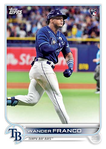
https://www.beckett.com/news/2022-topps-baseball-card-design-revealed/
I actually like this one! Wish the team name was a little bigger, but the logo is right there, so I can deal with that.
We haven't been shown images of the backs yet. If the type is as clear as the front (and the numbers as prominent as 2021), I'll probably like that too.
What do you think about it?
Edit: Added the image here from the article.
Edited on: Jul 15, 2021 - 10:05AM
-------------------------------
-- Dan -- Note: Please see my profile for more info regarding trading (section updated 3/4/2024). I have added a large portion of my inventory to the site, and currently have trading turned on (details are in my profile). |
|
|
|
|

tpxcards
Posts: 854
Joined: Jun 2019
|
| Thursday, July 15, 2021 9:50 AM | |
Much better. Worst thing about the 2021 design to me is that the player names are so small and scrunched together.
But overall my complaints about Topps sets are rarely the design, rather the amount of subsets they put into it including having more than one card that isn't a variation for the same player, especially in the same series. There's enough players that they could fine 792 or 900 or whatever people to make cards for.
-------------------------------
TCDB Collection Leaderboard spots:
#1 Alexei Zhamnov #1 Shane Doan #1 Phoenix Coyotes #1 Arizona Coyotes |
|
|
|
|

sheepboy
Posts: 232
Joined: Mar 2017
|
| Thursday, July 15, 2021 9:51 AM | |
looks like bowman...does that mean bowman is gettig a whole new topps style design?
|
|
|
|
|
griffey423
Posts: 652
Joined: Jul 2014
|
| Thursday, July 15, 2021 9:52 AM | |
The first thing I thought when I saw it was a cross between 2013 Topps flagship and a recent Bowman product. Then I paged down to read the article...and they referenced that it reminded the author of 2013 Topps. So...there you go.
Overall I like it. I'm a pretty easy going guy though. It would take a lot for me to dislike the design.
-------------------------------
Always looking for baseball variation/error cards and anything Garrett Whitley or Ian Anderson |
|
|
|
|
sandyrusty
Posts: 4,683
Joined: Dec 2014
|
| Thursday, July 15, 2021 9:59 AM | |
Pretty consistent with designs in the last 10-12 years which is fine.
Hopefully they have mega parallel sets of many colours fromt he rainbow and beyond. And maybe a glow-back parallel as well!
-------------------------------
Bruno -------- Check my Profile page to see my 2023 Goals and my Lists of sets near completion (5 cards or less) or sets getting close (less than 100 cards missing and 75% complete). https://www.tcdb.com/Forum.cfm/Page/B/ID/0/?MODE=VIEW&ThreadID=25745&C=0 |
|
|
|
|

rmpaq5
Posts: 2,031
Joined: Nov 2014
|
| Thursday, July 15, 2021 10:03 AM | |
And different foil parallels to all the colour parallels too!
Actually the first card set that popped into my mind was 1976 Topps.
|
|
|
|
|

John1941
Posts: 120
Joined: Jan 2019
|
| Thursday, July 15, 2021 10:12 AM | |
It looks better than 2021, at least.
-------------------------------
|
|
|
|
|
OverkillKid
Posts: 192
Joined: Dec 2020
|
| Thursday, July 15, 2021 10:12 AM | |
I love this design from topps. The player name being more of a focus point is nice, and more of the card will be of the photograph instead of a large design. Good call by topps on this one. I also believe the parallels for this design will stand out nicely.
-------------------------------
|
|
|
|
|

sahal694
Posts: 1,077
Joined: May 2016
|
| Thursday, July 15, 2021 10:39 AM | |
Not too bad. As others have said reminds me a little of Bowman.
On a side note, do you think they will ever go back to having the flagship set more like portraits instead of in action?
-------------------------------
|
|
|
|
|

jimetal7212
Posts: 4,888
Joined: Dec 2016
|
| Thursday, July 15, 2021 10:40 AM | |
Why not? Topps had a Bowman design this year so it's only fair.
But I do like this design for a Topps card.
-------------------------------
Tired and trembling I am descending, will I have to stay here and live this life again? |
|
|
|


")