
Total Cards: 720
Rating: 5.1 (182 ratings)
Rate this set...
Set Links
Set Links
Overview | Checklist | Teams | Errors / Variations | Hall of Famers | Rookies | Inserts and Related Sets | Comments | Packaging | Pricing | Sell Sheets / Ads | Trivia | Videos | Forum | External Links | Change Log | Contributors | Glossary | Gallery | Card Rankings | Collection Summary
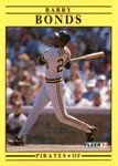
1991 Fleer
User Comments |
Definitely not my favorite, but it was my first completed set. Rating: 2 | ||
I think every friend I had, and myself received this set for their birthday or Christmas. I loved the pro-vision cards so much that I kept buying packs to get the black bordered ones too. Sadly I was only 8 years old, so had quite the mishap with BBQ sauce while sorting through my cards. Either way the set is nothing special as far as quality, but the nostalgia factor is extremely high for us 40 somethings. Rating: 7.5 | ||
hard to believe but not as bad as 1988 Donruss Rating: 4.5 | ||
This is one of few sets that the back of the card is much better looking than the front of the card. If you get bored with this set or think the front is ugly......just look at the backs of the cards and sort/collate/display by back only. They aren't so bad if you don't look at those awful fronts! | ||
I love 1991 Fleer! - No One Ever.
Rating: 5 | ||
At the time I didn’t buy a ton of these cards. As I’ve grown older, black and yellow have become my favorite colors and I love the set design. I need to pick up so old boxes of these at some point. Rating: 10 | ||
I have the steve Avery card #681 with a drastic error on it. It has the player picture on front but the stats side is completely blank. Is this card worth anything? | ||
Just think how much different this set would have looked if it had been color coded borders by team... Yellow looks great with the Pirates, imagine if the A's were Yellow with Green font, The reds could have been red with perhaps white font etc. Might have looked pretty cool. My Brew Crew could have been yellow with Blue font... Rating: 2.5 | ||
This was definitely the first pack I ever opened... And in fact, I opened several packs of these bananas in search of Atlanta Braves cards. I was 7 (almost 8) and discovered baseball because of the Braves playoff run that year. My mom and I went all over town to every place we could find to gobble up as many packs of cards as possible, hoping to find all our new favorite Braves players.
| ||
My First Pack Ever.
| ||
After 25 years I finally went through my factory set (opened at the time but evidently not checked) and found 7 cards missing: #540 (Bip Roberts), 491 (Curt Schilling), 377 (Joel Skinner), 370 (Chris James), 369 (Brook Jacoby), 191 (Frank Wills), and 167 (Jim Acker). Also, the included 50 stickers did not form a complete set of stickers. | ||
Indeed, this is a not-so-nice set. Fleer was pumping out cards so fast that they used two different printing companies to manufacture the cards, which is why pictures sometimes have slightly different croppings on the same card. Yellow design is sort of ugly, but the addition the head shot on the back of the card was an improvement over their 1990 design. Ultimately, the desire to print and sell so many cards by Fleer in 1991 makes this set fairly worthless other than for nostalgia about the teams and players of this era. You cannot blame Fleer for printing so many because collectors gobbled them up. Rating: 3 | ||
One of the worst sets ever made, if not the worst. Bright yellow.. I think only 1987 classic tried the same thing. Also when you tried to rub the cards together, to straighten them out or order them, the material had a very difficult time allowing you to do so. No players or rookies of any significance. After a solid 1980's run for Fleer, it's amazing they shipped this one out. Rating: 1 |


")