| Posted By | Message |
|

tpxcards
Posts: 841
Joined: Jun 2019
|
| Tuesday, January 24, 2023 9:22 AM | |
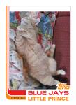
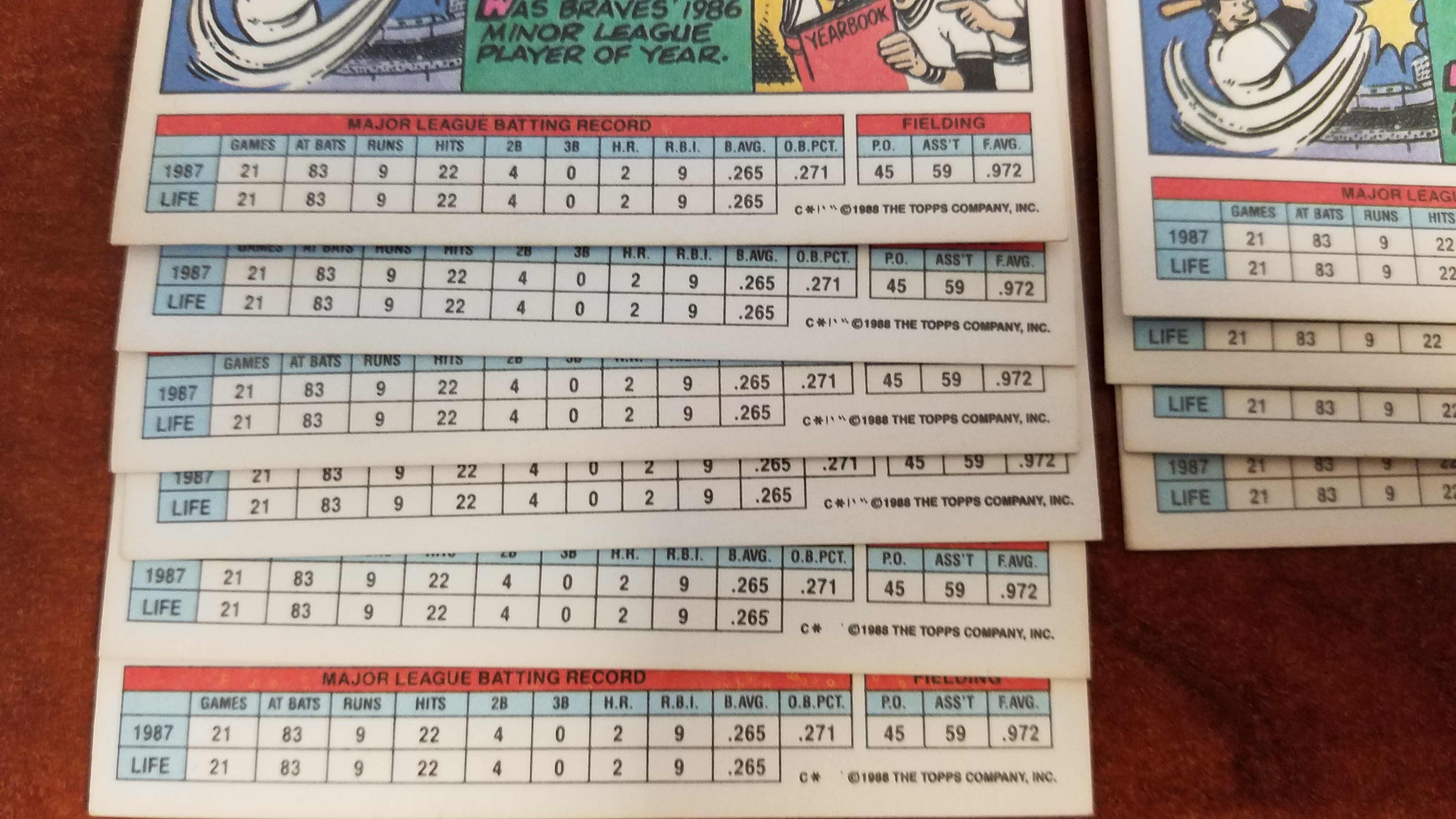
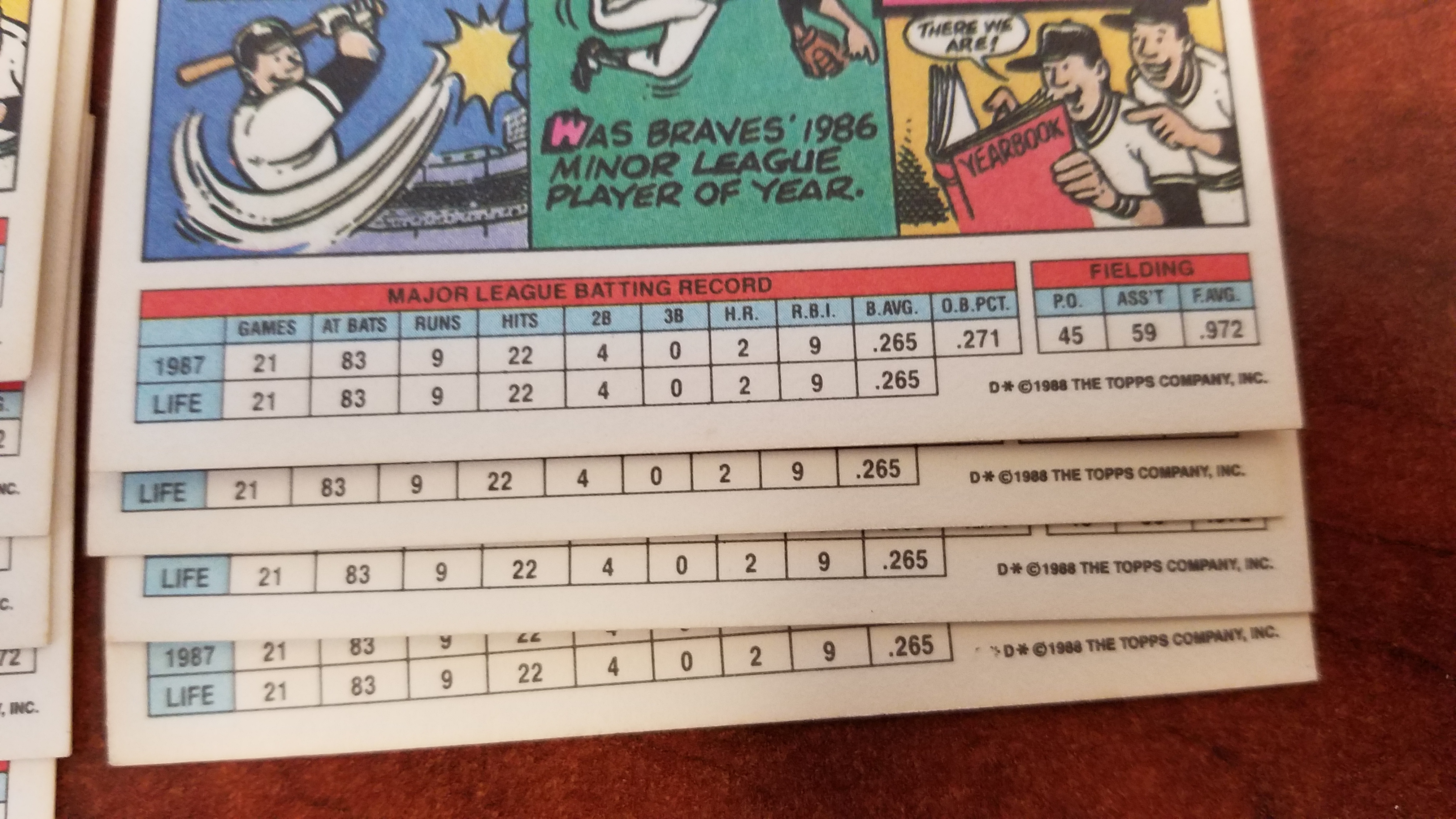
First pic is the C vars and second pic is the D vars
These are all backs from #249 Ron Gant
As can be seen, there is a C var that has the * space and a dot, and a C var that has *|'" symbol
And for D there is D* and and obscured symbol before the D
For the D, if there is an unobscured mark like C has, it will have to wait, but I figured I'd post the picture now for reference.
Want to know whether the C var should be added to the checklist or not.
-------------------------------
TCDB Collection Leaderboard spots:
#1 Alexei Zhamnov #1 Shane Doan #1 Phoenix Coyotes #1 Arizona Coyotes |
|
|
|
|

vrooomed
Posts: 14,949
Joined: Dec 2012
|
| Tuesday, January 24, 2023 9:40 AM | |
My personal opinion is no, these should not be added.
-------------------------------
-- Dan -- Note: Please see my profile for more info regarding trading (section updated 3/4/2024). I have added a large portion of my inventory to the site, and currently have trading turned on (details are in my profile). |
|
|
|
|

C2Cigars
Posts: 11,467
Joined: Oct 2014
|
| Tuesday, January 24, 2023 9:53 AM | |
Looks like mere printing glitches.
-------------------------------
Someday my cards may double in value and then be worth half of what I paid for them. |
|
|
|
|

jacksoncoupage
Posts: 194
Joined: Nov 2017
|
| Tuesday, January 24, 2023 6:55 PM | |
I know this stuff is tedious and the knee jerk response to most of it is "no" "print glitch" etc but the means in which Topps airbrushed the 2nd letter in the sheet codes in this set is not some wide range of differences. Most cards have one or two ways of covering the letter they wish to remove. Some cards went through a few different printings. This isn't stray ink or misprinted cards, these are actual changes Topps made to the plates, as frivolous as they may be.
If the TCDB powers don't wish to tackle this stuff, I can understand that but saying it is a "printing glitch" is just factually incorrect.
-------------------------------
Owner and creator of JunkWaxGems, online source for unlisted error, variation and oddball info from the junk wax era. |
|
|
|
|
sandyrusty
Posts: 4,652
Joined: Dec 2014
|
| Wednesday, January 25, 2023 3:10 AM | |
When I sorted mine, I did not look at them as airbrushed, just a very poor inking. These were some of the worst VAR we have included on the site.
-------------------------------
Bruno -------- Check my Profile page to see my 2023 Goals and my Lists of sets near completion (5 cards or less) or sets getting close (less than 100 cards missing and 75% complete). https://www.tcdb.com/Forum.cfm/Page/B/ID/0/?MODE=VIEW&ThreadID=25745&C=0 |
|
|
|
|
jacksoncoupage
Posts: 194
Joined: Nov 2017
|
| Wednesday, January 25, 2023 8:37 AM | |
But that's the thing, they aren't the product of inking issues. Whatever word is used to describe it, Topps applied a coverup method over one of two letters in the sheet code. You won't find an entire spectrum of letter visibility for each player as you would if it were "poor printing" or whatever. Topps has done this same thing to the sheet codes in other sets as well: 1990 FB, 1993 BB to name a couple.
-------------------------------
Owner and creator of JunkWaxGems, online source for unlisted error, variation and oddball info from the junk wax era. |
|
|
|
|
tpxcards
Posts: 841
Joined: Jun 2019
|
| Wednesday, January 25, 2023 11:10 AM | |
It is a slippery slope once variations are allowed, to what lengths is the site willing to go to track them? I don't have a problem with whether or not the site Admin or high Ls want to track a card or not, I'm going to keep the extras anyways. I walk in their shoes already. Just wanted to post to see whether it should be added and if they say no, then it is no. I will just manage it myself, just like the 94 Collector's Choice Factory Set hologram variation that was previously rejected for inclusion.
-------------------------------
TCDB Collection Leaderboard spots:
#1 Alexei Zhamnov #1 Shane Doan #1 Phoenix Coyotes #1 Arizona Coyotes |
|
|
|
|
Lea DeFoote
Posts: 1,533
Joined: Jul 2012
|
| Wednesday, January 25, 2023 11:38 AM | |
Interesting. So you're saying that C* and D* both appear on the plate, and are alternately obscured to make the two versions? I see that now.
You realize that makes the differences illustrated in the above photos, by definition, 'printing glitches', right?
Ironically, the situation you describe would be evidence to support an argument that C* and D* aren't even separate variations, since both markings appeared on the printing plate at all times.
-Tom
-------------------------------
Ted Musgrave card collection 98.9% Complete: Cards Known: 1013, Cards Owned: 1002 I prefer the company of people who disagree with me for the right reasons over the company of those who agree with me for the wrong reasons. |
|
|
|
|
jacksoncoupage
Posts: 194
Joined: Nov 2017
|
| Wednesday, January 25, 2023 2:02 PM | |
The guy who called them printing glitches is suggesting that they are inking errors/misprinted cards, which they are not. The exact type of edit can be found repeatedly with little effort (none are terribly rare) for each of Topps' attempted correction types. Not an issue of stray markings, etc.
Originally, in this example, at least, Topps printed the card with C*D* before the copyright. Topps decides to eliminate the C* portion and scrawls out much of the C* with some remnants still visible. Topps then goes on to remove the remainder (in this case, not 100%). The final version being just D*. If a C*D* version exists, it would extremely rare but I strongly doubt it.
I did most of the discovery work with these Topps Big copyright variations and built multiple master sets between 2005-2010. It has been my belief that 1988 Topps Big went through twom but more likely, three, distinct printings. Steve Buechelle and Fernando Valenzuela's cards are key to understanding it.
1988 Topps Big Variations Blog
-------------------------------
Owner and creator of JunkWaxGems, online source for unlisted error, variation and oddball info from the junk wax era. |
|
|
|
|
MViP
Posts: 70
Joined: Nov 2022
|
| Thursday, January 26, 2023 4:09 AM | |
Very interesting discussion. I wonder some things. 1. Why do companiss have A or B or C ..... etc. designations near the copyright at all? Do they mean more than just being a diferent letter? 2. Why, in these Big series cards discussed here was Topps messing around with the plates at all? 3. Why do we have variations like the Donruss Inc. V. Inc (No period) or the Fleer U.S.A. v. U.S.A (no period)? Did they remove the period or ad it after some amount of runs or do they have more than 1 plate and if so why would they be different? 4. Why do (or did) companies (or Fleer) have such a hard time covering up errors once discovered (see 89 Fleer Johnson Marlboro and Ripken f.ck face)?
Is this all for our entertainment? To give people more to collect? Are they just messing with us? Ahhh to be a card printer.....or better yet to be the (whatever or whomever it is) that decides which player get what number......
********Anyone know a Youtube or something that shows how cards are made?
-------------------------------
Counters Always Welcome. MViP. |
|
|
|


")