| Posted By | Message |
|
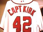
captkirk42
Posts: 2,269
Joined: May 2011
|
| Thursday, April 9, 2015 6:46 AM | |
I'd have to go with 1995. The script name is difficult to read sometimes to begin with then when it is gold or silver leafed, like the 1993 Gold parallels it is harder to read. Plus the ink had a tenancey to flake off or ware off like the early versions of Topps Gallery making a white indentation on a white backbground nearly impossible to read. If there is enough of the imprint left after turning the card around in various angles to adjust the light hitting it sometimes you can read the name.
-------------------------------
I collect: Baseball, Football, Hockey, Mostly Vintage pre1980, My Homie teams - Washington/Baltimore Teams Senators (Twins, Rangers), Expos/Nationals, Redskins, Capitals, Bullets/Wizards - HOFers - Non-sport (mostly TV shows and movies). My Trade List is very much a work in progress CaptKirk42s Trading Card Blog Curly W Cards Strive For '65 YouTube klandersen42 |
|
|
|
|

Joeyd011
Posts: 66
Joined: Apr 2014
|
| Thursday, April 9, 2015 9:49 AM | |
It's all a matter of opinion of course, and I used to not like '90 Topps, but right now I would have to go with '93 and '94 Topps. Over time, I have went from hating some designs, like the '68 Topps, or the '81 Topps for instance, but they grew on me after a while. '91 Topps is one of my favorite simple designs for Topps 40th anniversary, the photography is what really stands out though. I really like the Topps Tiffany for '91, much better card stock, printing and focus than the regular set. Big difference.
|
|
|
|
|

switzr1
Posts: 6,332
Joined: Dec 2013
|
| Thursday, April 9, 2015 9:24 PM | |
I go with 1999 Topps here. Reuse of the border color from the prior year. Player names are small, sideways, and quite hard to read. Backs are actually fine by my standards, but that isn't enough to forgive the front. For an older set (older than me, at least), I've never really liked 1972.
-------------------------------
I'm going to reevaluate how I collect after the new year. It's just getting way too expensive for the new stuff. Sometimes I just want to buy a pack, not a whole box or even blaster. |
|
|
|
|

Id8jlb8666
Posts: 35
Joined: Sep 2012
|
| Friday, April 10, 2015 1:08 AM | |
Least favorite front - 1996
Least favorite back - 1982
|
|
|
|
|

Billy Kingsley
Posts: 7,512
Joined: Aug 2011
|
| Friday, April 10, 2015 2:25 AM | |
I may be the only one in the world, but I consider 1990 Topps to be my all time favorite baseball set design. Granted, I have not seen all of them, but I've seen all of Topps's issues by looking around on the Database, and many from other companies.
I can't think of a single way to improve the 1990 design. The colorful borders, the texture built in, the old style card back...everything is just so darn perfect.
-------------------------------
VERY slow trading due to health problems. Not transferrable so safe to trade with, just moving is painful and can't always access the cards. Cardboard History My COMC New Collection Website: Cardboard History Gallery (Still under construction) Tips on how to make your scans look like the card does in hand (No more washed out, fuzzy scans!): |
|
|
|
|
clauzon
Posts: 9
Joined: Jun 2015
|
| Wednesday, August 12, 2015 12:40 AM | |
I think 98 is actually my least favorite but i have to agree with some of the others about not being a fan of the 86 design either.
|
|
|
|
|

mzentko
Posts: 2,472
Joined: Jun 2012
|
| Wednesday, August 12, 2015 9:32 AM | |
I actually like the 86 set alot
I would go with 99 like suggested above just because it was same border as 98, and frequently confused the two years for me
mark
|
|
|
|
|
mzentko
Posts: 2,472
Joined: Jun 2012
|
| Wednesday, August 12, 2015 9:32 AM | |
I actually like the 86 set alot
I would go with 99 like suggested above just because it was same border as 98, and frequently confused the two years for me
mark
|
|
|
|
|

C2Cigars
Posts: 11,503
Joined: Oct 2014
|
| Wednesday, August 12, 2015 9:38 AM | |
Definitely, the 1990 Topps is one of the worst, most visually painful designs. To me it's like a modern update to the 1975 Topps, another contender for worst ever.
-------------------------------
Someday my cards may double in value and then be worth half of what I paid for them. |
|
|
|
|
mzentko
Posts: 2,472
Joined: Jun 2012
|
| Wednesday, August 12, 2015 12:12 PM | |
no way on 75!
it is regularly very high on polls/tournaments of favorite year of cards..
75 might not be for everyone, but overall a lot of people like that year..
fun thread, keep it going!
mark
|
|
|
|


")