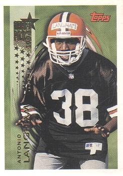
Didn't chime in on this one. Not sure if I missed it completely or if my comment was too much of a hate rant. Anyway the foil lettered name is difficult to read especially when it is vertical. Oh and it's all caps with last name bigger than first name. No team logo or name mentioned on front. Weird logo thing going on behind the player makes it look like he is wearing some kind of head dress, or has long dreads or similar hair spikes coming out of the helmet. Porcupine like - The Cleveland Hedgehogs? Back is very plain but OK, could be improved.
I collect: Baseball, Football, Hockey, Mostly Vintage pre1980, My Homie teams - Washington/Baltimore Teams Senators (Twins, Rangers), Expos/Nationals, Redskins, Capitals, Bullets/Wizards - HOFers - Non-sport (mostly TV shows and movies).
My Trade List is very much a work in progress
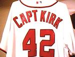
CaptKirk42s Trading Card Blog Curly W Cards Strive For '65 YouTube klandersen42


")