| Posted By | Message |
|

curling2019
Posts: 118
Joined: Jun 2021
|
| Wednesday, July 12, 2023 8:22 AM |
|
Despite its reputation, I don't mind this set. The front is very easy to read, and there are full color headshots on the back. Not a great design, but not bad.
-------------------------------
"Perfection is not attainable, but if we chase perfection we can catch excellence." -Vince Lombardi |
|
|
|
|

cdorso
Posts: 232
Joined: Aug 2019
|
| Wednesday, July 12, 2023 9:01 AM |
|
Hey! One of my guys is the card of the day. Cool.
|
|
|
|
|

dilemma19
Posts: 239
Joined: Jul 2015
|
| Wednesday, July 12, 2023 9:15 AM |
|
It's bright, but not much wrong with the design otherwise.
They should have made the update set orange or something.
|
|
|
|
|

Mr Riggy
Posts: 382
Joined: Jul 2020
|
| Wednesday, July 12, 2023 9:15 AM |
|
Great card, well at least when it comes to sorting.
-------------------------------
|
|
|
|
|
Mr Riggy
Posts: 382
Joined: Jul 2020
|
| Wednesday, July 12, 2023 9:15 AM |
|
Great card, well at least when it comes to sorting.
-------------------------------
|
|
|
|
|

brewerfan34
Posts: 73
Joined: Jan 2020
|
| Wednesday, July 12, 2023 1:10 PM |
|
One of the best insert sets of all timehttps://www.tcdb.com/Checklist.cfm/sid/10236/1991-Fleer---Pro-Visions
I don't care what anyone says, this product is still fun to open. Who doesn't love to pull a Bo Jackson or Griffey? The fun of pulling a Griffey from a early 90's wax or rack is still the same 30 years later.
Thanks, Frank
|
|
|
|
|

Onemorepoint
Posts: 1446
Joined: Apr 2014
|
| Wednesday, July 12, 2023 1:58 PM |
|
If you don't like this then there's something wrong with you.
|
|
|
|
|

mwccards
Posts: 185
Joined: May 2018
|
| Wednesday, July 12, 2023 3:32 PM |
|
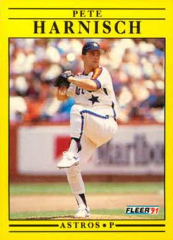
There's no mistaking it for anything else, that's for sure. I like being able to look at a card and immediately know what year/set it is. This particular player's card is really well composed with the way the player is framed in the shot at the top of his windup. That's a baseball card, man!
|
|
|
|


")