Sunday, March 1, 2020
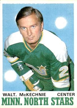
Year: 1970-71
Set: O-Pee-Chee (Rate)
Card: #172 Walt McKechnie
“ I like this design. ” -Brendan Barrick
“ Ohh, vintage hockey, nice! I wish I had gotten the chance to experience the North Stars. Green and yellow are my favorite colors so I probably would have rooted for them. Of course, the team still exists, but is now in Dallas and doesn't wear yellow. ” -Billy Kingsley
“ Nice, I really like it. Both front and back. ” -Thomas_Kava
“ I love it. The drawn characters on the back by the card number are a big plus for me as well as the font for the teams on the front. ” -rmpaq5
“ Awesome. Cool old card. But I always hated the white dots on the cards in this set. Not sure what they add to the design or what they are supposed to be. They look like someone used a pencil eraser on the card. ” -cjjt
“ When collecting the older hockey cards, I always prefer the OPC over the Topps. ” -Mscott713
“ This is a very nice card, but I don't like the abbreviation for Minnesota. ” -muskie027
“ Front is ok for the era, but the back is great forever. He looks more like an accountant than a hockey player though. ” -davidhandberry


")