Tuesday, September 11, 2018
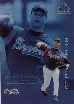
Year: 2004
Set: SP Prospects (Rate)
Card: #172 Jose Capellan
“ How do you use the same photo twice on the front? They liked it so much, they used it a third time on the back. Not a good card. ” -muskie027
“ Look out Jose! A giant version of you is going to step on you and crush you any second! Seriously? Three photos all the same on the same card? ” -rmpaq5
“ so all they could find was one picture for this guy and use front and back and I thought Panini were bad, back is absolute rubbish do you really need his name twice, take out the middle and show some stats or something ” -aussiewayne
“ Front is kind of too dominated by the background picture (if that makes any sense). The backs are okay, though I like to see at least some stats. ” -olerud363
“ 3 photos on this card. All the same photo. Ridiculous. ” -parsley24
“ Andy Warhol's estate should have gotten royalties for this design. ” -vrooomed
“ Missing minor league stats on the back will probably be a sore spot for this card. Interesting concept for the front. I am neutral opinion on this type of card. ” -CollectingAfterDeath
“ Not digging this one. Not just for using the same photo 3 times but the aesthetics of the design are not pleasant. Is that the player name I can't read because it is in foil lettering and dark on a dark background (above the team logo)? OK the guy is only a prospect but couldn't they have put some stats up? His High School Batting Average or ERA maybe? ” -captkirk42
“ I always thought it was weird when they put the same image twice on the same card ” -Declan44
“ 3 copies of the same picture. If there were 3 different pictures, I'd think it was a fine card. But this way... eh. ” -cjjt
“ I've said it over and over again, the thing that annoys me most about some cards is using the same photo on front and back. I was wrong. ” -kents_stuff
“ It's incredible how there are more misses than hits on these prospect cards. Who am I to say anyhow? Jose got his name and face on a card, better than I ever did... ” -rmitchell6700


")