
Random Card of the Day |
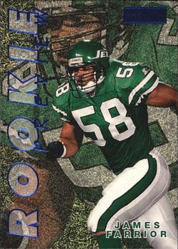
Wednesday, April 5, 2017Year: 1997 Set: SkyBox Premium - Rookie Preview (Rate) “ I like the blue foil. Not bad for an insert. For a base card I would not care for it much. But since it's not, it's all good. If I watched football I'd probably root for the Jets. They are local-ish (I'm in their TV market) and they wear green, my favorite color since birth. ” -Billy Kingsley
“ Too busy on front. Blowup of same picture as background. Vertical title reading vertically bottom to top bad. Player name blends into image. Can't even read "Skybox" on the Skybox logo, does it even say "Premium"? Back with the 7 of 15 SP clued me into the fact it was an insert set not part of the base set. Good it would be a bad base card. Info on back of the card is OK since it is an insert. ” -captkirk42
“ How I miss the old Jets logo. ” -carthage44
“ Since this is an insert, I am going to say I love it. I think everything that makes a card awful is reversed when a card is an insert. I don't want my inserts looking like base set cards, and I don't want my base set looking like an insert. With that said, the color looks amazing. I like the background photo and the granularity, the giant name of the insert set and the small name on the front. A+ as an insert! Also, inserts need stories on the back, not stats, so another plus! All this and I hate the Jets, so that is saying something. ” -muskie027
“ Fantastic picture, but I believe they should have used the underlay instead and maybe we could see the intensity in his eyes. I'm okay with the transparent ROOKIE, but the name seems secondary and almost hidden at the bottom of the card. ” -Sportzcommish
“ as much as i hate the jets, i kinda wish they'd go back to this logo ” -Thunderfoot
|


")