Random Card of the Day
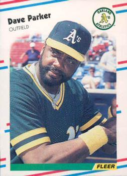


Saturday, February 11, 2017

Year: 1988

Set: Fleer Update - Glossy (Rate)

Card: #U-55 Dave Parker


“ Never had one of the glossy's, but I always like this design for some reason. There isn't anything great about it, but I liked it. It just looks like a Fleer card. ” -muskie027

“ Washed out scan of a nice design. Not a fan of Update series, Just call it series 2 or 3 or whatever and number them consecutively. ” -Billy Kingsley

“ The photo is good and the placement of the name and the logos is fine, but I just don't like the cheesy border. They improved the border in '89, but digressed again to the plain in '90 and went wild with the bright yellow in '91. ” -Sportzcommish

“ Pretty good, I have some of them and I like them ” -Thomas555

“ Loved the Update sets! ” -carthage44

“ this is mine and the scan looks like crap. ill need to redo this. must have been from scanner #1. Doesnt look glossy at all. ” -ThemightyOx

“ Always liked this design, never cared for the glossy or tiffany versions. ” -hphillips

“ "The Cobra" ” -grim25

“ Classic Neo-Vintage mid 80s Fleer. Dave Parker. I think of him more as a Pirate. I recall the late 70s early 80s "turning 7-Up" commercials with him and a bunch of other athletes of the time. https://www.youtube.com/watch?v=6HzFsRPP18c ” -captkirk42

“ I always liked Parker. Not a huge fan of this design but not bad. ” -Mitch


Additional Comments

Posted ByMessage

collect-a-set

Posts: 81
Joined: Feb 2013
Saturday, February 11, 2017 12:16 AM

Loved this design!


FuriousGeorge

Posts: 72
Joined: Feb 2016
Saturday, February 11, 2017 9:21 AM

Fleer had much worse designs, but you can find at least a half dozen of these in every dollar store grab bag.


pksteinberg

Posts: 12
Joined: Apr 2016
Saturday, February 11, 2017 10:30 AM

I always felt the 1988 Fleer design was clean and find I still likt it today. I like Parker better as a Pirates!


Joeyd011

Posts: 66
Joined: Apr 2014
Saturday, February 11, 2017 3:25 PM

The '88 Fleer isn't my favorite design regarding 1980's baseball cards, but it has the 4 main ingredients necessary in my opinion;  legible player name, player position, team logo on front, and extensive statistics on the back of the card, which is perhaps more of a bonus than a necessity, but still a nice touch.  Certain designs do tend to grow on me however, so I may like it a little more in the future.  


junkwax78

Posts: 9
Joined: Feb 2017
Saturday, February 11, 2017 4:17 PM

I enjoy the '88 fleer set.  Never owned any glossy but I'm sure I got some updates around.  The Edgar Martinez and Tom Glavine cards are favorites of mine to hoard.


Log in or register to continue.


Copyright © 2024 Trading Card Database LLC
Designated trademarks and brands are the property of their respective owners.