Thursday, February 2, 2017
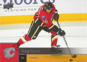
Year: 2009-10
Set: Upper Deck (Rate)
Card: #174 Craig Conroy
“ I really, really like the 2009-10 Upper Deck design. They used it in NBA also, and with a slight modification in MLB. To me it looks great. The NBA set is way expensive if you can even find it, but now that I'm collecting hockey maybe I can hunt down a box of them... ” -Billy Kingsley
“ I am a huge fan of this set. The colors really popped well, especially for teams like Calgary and Minnesota. The white ice often washes out hockey cards, so having bright colors really bring an impact. ” -Howintensive
“ Looks like a pretty solid player that bounced around a lot. ” -carthage44
“ Nice Action Shot. I do like they let you see the puck and stick through the coloring. ” -kirkscards
“ I don't follow hockey, but to me this guy could serve as a logo ala Jerry West for the NBA or MJ for Nike. He does remind me of the old Nintendo Blades of Steel or Ice Hockey characters. ” -Sportzcommish
“ Meh. Never really collected much hockey. However, the Upper Deck set for baseball (and I believe football too) was just like this. I'm okay with the design. The name, position, and number on the front seem a little small. I remember the codes on the back (lower left) for Upper Deck Kids - I ended up submitting so many as a 15 year old or so that I won a hobby box of 2008 Upper Deck First Edition baseball. But I digress. Overall I like this Upper Deck design, even if it doesn't carry quite the charm of the early 90s. ” -jasongerman9
“ I like this design for the baseball set, looks good with the hockey set as well. ” -tenlbpain
“ When I first saw the 2009 UD Baseball I hated it but sought to collect my Homie Nationals in it (might still need a few not sure) then grew to like the set. Hockey and the other sports followed suit with this design Now I like it, it isn't so bad. Upper Deck has had some sets that are worse. Back is pretty standard for modern cards. I miss the silly cartoons on the back myself. ” -captkirk42
“ On a day where Upper Deck failed on the ROTC with the Gretzky debacle, the card we get to write on is UD. Well, I say they redeemed themselves. This is a nice card. Good photo, coloring, name position and number boxes are not too large and are translucent so it doesn't ruin the picture. The team logo is nice and has the same effect as well. This was in my brief time off from collecting, but I really like it and would have been very happy that year with this design. ” -muskie027
“ Nice looking card, but Craig who? ” -Kirokyukan


")
