Random Card of the Day
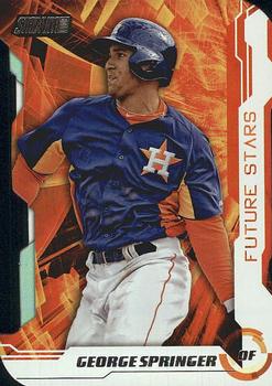


Sunday, January 24, 2021

Year: 2014

Set: Stadium Club - Future Stars (Rate)

Card: #FS-10 George Springer


“ Kinda looks like he's dancing. Cropped a little too closely perhaps? ” -Billy Kingsley
  5
“ This design bothers me. It looks like he has no arms...Also too busy for me. ” -Camstone
  2
“ this guy is about to be very rich.....awesome player that would look great in a Met uniform ” -Tmac7

“ Reminds me a little of the 2020 Topps design. ” -muskie027

“ Astros. Big thumbs down. ” -switzr1
  1
“ I guess they were right about the "future star" thing ” -DarkSide830

“ How can he hit the ball like that with things exploding all around him?!?! Amazing! ” -kents_stuff

“ Nice looking card but looks like it should be a Flagship Topps insert not Stadium Club insert. ” -captkirk42


Additional Comments

Posted ByMessage

Pinkpony1967

Posts: 304
Joined: Jan 2021
Sunday, January 24, 2021 4:14 AM

Not a fan of the background or the cropping of the image . looks like something that should have been left in the 60's


Onemorepoint

Posts: 1446
Joined: Apr 2014
Sunday, January 24, 2021 7:33 AM

Would look better without the orange background and looks much older than 2014.


BaseballNerd10

Posts: 26
Joined: Dec 2019
Sunday, January 24, 2021 8:33 AM

Card design is atrocious.  


Derek McDonough

Posts: 480
Joined: Jan 2020
Sunday, January 24, 2021 9:46 AM

I have to agree with the majority here.  Cropping out body parts is just bad on a card.  Gotta be full torso and head shot, or full body on the main subject of the card.  The background is ridiculous.


-------------------------------

Minor League Collector, Collecting cards featuring players in Cedar Rapids uniforms or Logos, all sports, from past and present.  Researching forgotten set variations.


MTHRILL22

Posts: 39
Joined: Dec 2019
Sunday, January 24, 2021 12:10 PM

I don't mind inserts that remove "real life" backgrounds, but this one misses the mark.  It is zoomed too much into his hitting position and the color scheme doesn't work with his attire/sleeves.  Agreed, good call labeling him a Future Star back in 2014.


fedoratipper

Posts: 217
Joined: Jan 2016
Sunday, January 24, 2021 6:42 PM

Too much orange on one card. 


tcarter

Posts: 170
Joined: Sep 2016
Sunday, January 24, 2021 7:02 PM

I will say that the card doesn't look as bad in person.  The orange in the background is a shiny foil and his sleaves aren't, which helps compared to the scanned look of the card you see here.


Log in or register to continue.


Copyright © 2024 Trading Card Database LLC
Designated trademarks and brands are the property of their respective owners.