
Random Card of the Day |
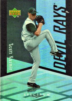
Wednesday, July 15, 2020Year: 2007 Set: Upper Deck Spectrum (Rate) “ Another photoshopped card. Why don`t they try to use an action shot and apply the spectrum design??? ” -dollar guy
“ This card must look awesome in hand. I've never encountered any of this set in person, but you can tell it's all holofoil, which is great. ” -Billy Kingsley
“ While I can appreciate the attempt at the design, it's always bad when the notes about the copyright are longer than those about the player. ” -volbox
“ Nice looking card. Upper Deck always got it right with baseball. I know they make hockey but If they would come back and make a baseball set it would be awesome. ” -ericidol1984
“ I expect the floor to light up like the Billie Jean video when he pitches the ball. ” -switzr1
“ Back from vacation. I was looking forward to writing something witty about a card and get this card. I will wait until tomorrow to write something. ” -parsley24
“ The pitcher steps into the crystal box and goes into his wind up... High dislike of chromeness. Don't like the sideways name and team name towers. Back OK but not great much better than the front. ” -captkirk42
“ Wow! what a BORING card....If you are going to change to non-sports back ground at least make it flashy or something....and the back.....ugh...so much empty space with nothing there!!! ” -Gator415
“ Whatever Upper Deck was trying to accomplish with this design - it didn't work. It looks like an action figure inside a plastic cube. Some may find it attractive, but if they do, it call their taste into question. Ironically, there's much they tried to do, if the individual components are broken down. But together, it looks like a lot of nothing. Definitely being a case of the sum of the parts being lesser. ” -georgecf
“ Not really digging the design. I get what they were going for, but--meh. The back is standard late 2000's UD. Not a bad card, but not great either. All that aside, I need this card... :D ” -Vonnegut37
“ Not Upper Deck's better effort but that's what happens when you try and keep up with all the others in a multiple release filled era. ” -baseballcardstoreca
“ I usually hate these designs, but this looks pretty cool. I don’t know about a whole set, but it is a great design for an insert concept. ” -muskie027
“ Interesting design. His first year in the majors being 2004, I can see why the back is a bit empty. This set kind of grows on me the more I look at the gallery. Not a bad looking card. ” -CollectingAfterDeath
|
Additional Comments
| Posted By | Message | ||||
|
Joined: Apr 2014 |
| ||||


")