
Random Card of the Day |
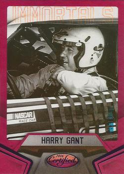
Monday, September 30, 2019Year: 2016 Set: Panini Certified - Mirror Purple (Rate) “ Nice looking front. The Immortals title should have been darker so it doesn't fade out but besides that the front is good. The back is boring. The paragraph should have been bigger and longer, or some stats or something. The Certified logo shouldn't be so large. ” -davidhandberry
“ The purple parallel seems like a terrible color for this card. Also, the back is really boring. It could really use some stats or a picture of his full car...something. ” -vanstryland
“ At first glance I thought this was an older card until I saw the date, manufacturer and the obvious Certified brand logo ” -captkirk42
“ He was one of the most debonair drivers to ever step foot in a stock car...well-liked and respected by drivers and fans alike. I'm a bit surprised Panini didn't Photoshop the Skoal Bandit off of his helmet though. ” -DocOso
“ Nice photo. Good to see an in-car shot. ” -NJDevils
|
Additional Comments
| Posted By | Message | ||||
|
Joined: Aug 2011 |
| ||||


")