Monday, May 1, 2017
Year: 2002
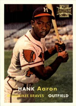
Set: Topps Archives (Rate)
Card: #168 Hank Aaron
“ At least with this version, other than the 2001 version, you can actually see without a microscope the card numbering on the back. ” -rmpaq5
“ Reprinted vintage cards was an idea that was neat when the craze first started, but now it's being way overdone. They've lost their appeal for me. Nice Aaron though. ” -olerud363
“ Hank. Aaron. I like. The card is cool too. ;) ” -Doe MG
“ Actually not a bad looking archive card. ” -uncaian
“ Tight card if it was the original. ” -carthage44
“ Fantastic Reprint. For these I don't mind the "ARchives" stamp too much, but on the back the super long modern copyright line has always bugged me. I think more recent reprints have been slightly better with the location of the copyright line, but with these obvious tack it to the side, or bottom in a separate box makes it almost like identifying it as a modern reprint was an afterthought. ” -captkirk42
“ I love the card (even if a reprint) and I love the fact that there was over four years between the front and back scans being submitted! ” -bkklaos
“ I like the concept of the Archives set, although I don't know enough to know if this is a reprint of a vintage card or a card that never was. I like the latter a little more but both would be something I would collect if I did baseball. Great scans. Rare to be able to read that small reprint text but here I can. ” -Billy Kingsley
“ Nice set for high-priced vintage fillers. ” -RoundtheDiamond87
“ A "vintage" rev-neg. Great card of a legendary player. Would love to own both this version and the original 57. ” -dilemma19
“ Even the reprints of the Topps 1957 set are classic. The first year Topps put career statistics on the back. The gold stamp in the upper right corner is the only downside to this set. Oh, the players is a good one, too. ” -jayoneill
“ Beautiful card. Hank looks so thin! ” -Sportzcommish
“ Many people consider the 1957 Topps design to be a classic and one of their favorites. As for me, I never really thought it was amazing. I like the simplicity, but the font just never did it for me. It looks like the white and yellow fonts you'd see in early color TV when they'd show you a grapic. Ugh, no. Also, I don't like that the font alternated in the same line. I think it would have been better for the name to be in ALL white or yellow, and then the team/position be in ALL of the other color. I do like the back though because it was able to fit a lot of information AND included stats from not just the previous season. I believe that was a first as well as the smaller card size. ” -Slug03
“ I love Topps Archives, so glad they started making it again a few years ago. ” -JoshReese92099
“ Great look of a retro card. Still not sold on these, but this looks nice. ” -muskie027
“ In my opinion, the real home run king ” -Bargunmaster
“ He probably would have been great even if he did bat lefty. ” -NJDevils
“ It's not the real thing, which is a shame. I have the real thing. One of my favorite cards. First card in my HOF binders. If I didn't have it, I wouldn't mind having this, as it's pretty nice. ” -vrooomed
“ Love archive sets! ” -cjjt
“ Great looking Archives card. Even better player. ” -Doc Floyd


