
Random Card of the Day |
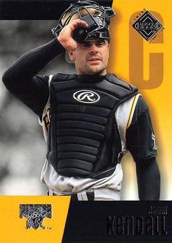
Tuesday, May 17, 2016Year: 2002 Set: Upper Deck Diamond Connection (Rate) “ Blah.... ” -carthage44
“ If the text was all in real ink contrasting with the background color it could be read. This foil junk writing is difficult to impossible to read. His name looks like "Jon Kondoll" Can't even figure out what the Upper Deck logo says. Back is OK could be done better, but will do. ” -captkirk42
“ Design is not bad, but the name is horrible to read in the scans. I assume it is better in person. ” -CluelessJoe
“ I think he's a catcher. The "C" right beside his face proves it if you weren't sure about his attire. UD wanted you to know his position, there's one thing bigger than the "C" and it's the picture. The exact same "C" on the back is a 0 or maybe an 8. ” -JimStaub
“ Nice card (foil notwithstanding) of an underrated player. ” -dilemma19
|

")