Saturday, June 28, 2014
Year: 1967
Set: Topps (Rate)
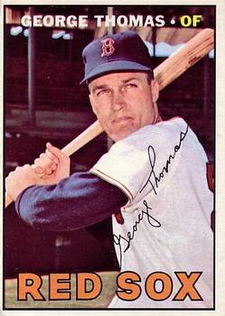
Card: #184 George Thomas
“ I think the '67 design is pretty solid. I like the big team name, although i dunno why "RED SOX" should be in orange. Rotating the signature at a crazy angle so it fits over the white of his jersey and is therefore legible is kinda weird. I'd say this is maybe the fourth-best baseball card design of the 1960's, behind 1963-65. ” -revnorb
“ I was always impressed by his defensive performance at Chickamauga. ” -UNC_Samurai
“ Great set! My father bought me this set for my birthday 30+ years ago. Thanks Dad! ” -CluelessJoe
“ Ah, the last set that I truly collected in my youth. Brings back great memories. I think I completed about half the set when I started chasing girls instead of Joe Pepitone. ” -NJdevils
“ Classic Sox! ” -jlaz10
“ Nice clean card. Picture is great and the signature doesn't cover anything important. Back has great information and I especially like the list of years played and the team name and stats. ” -yokonashiwa
“ My favorite Topps baseball set of the 60s, for sure. Such a simple but effective design. So much of the card front is dedicated to the photograph, yet we know who he is and who he played for too. I can overlook the pointless facsimile signature because everything else is just about perfect. ” -switzr1
“ 67 Topps is a work of art...no frills - just the picture accompanied with name, position, auto, and team...nice! ” -flcardtrader
“ This is my second favorite set of the 1960s (1965). The vertical format on the back was a nice change of pace. ” -vrooomed


