
Random Card of the Day |
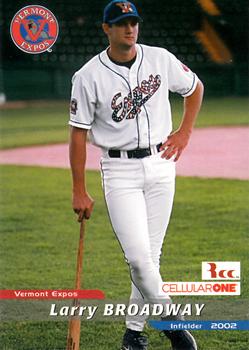
Friday, September 27, 2013Year: 2002 Set: Grandstand Vermont Expos (Rate) “ Larry Broadway here is too cool for school. And baseball. And uniform logo colours that don't sear the eyes. ” -Luckynumber78
“ Once again, a minor league/promo issue has a better design than many mainstream issues. I remember seeing TV ads for them while in Lake George NY, my favorite place in the world. ” -Billy Kingsley
“ There's a made-for-TV pose, but obviously not bound for the MLB.. pretty basic & clean design, backs are not so great.. ” -lyfestory
“ They say the neon lights are bright.... ” -Dave Sosidka
“ The last team to have been called the Expos ” -eyoung11
“ Nice design. The ad is a *little* intrusive, but not ridiculous. Backs are well-done. For a low-level minor league card set, this is *very* nice. ” -vrooomed
“ This is not real. This can't be real. Broadway refers to the sparkly Expos lettering on his chest, right? ” -marcbrubaker
“ Needs a border but not bad for a Minor League card. ” -koloth42
|

")