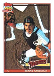
1991 Topps
Total Cards: 792
Rating: 7.1 (173 votes)
Rate this set...
Set Links
- Overview
- Checklist
- Teams
- Errors / Variations
- Hall of Famers
- Rookies
- Inserts and Related Sets
- Comments
- Packaging
- Pricing
- Sell Sheets / Ads
- Trivia
- Videos
- Forum
- External Links
- Change Log
- Contributors
- Glossary
- Gallery
- Stats
- Collection Summary
Set Links
Overview | Checklist | Teams | Errors / Variations | Hall of Famers | Rookies | Inserts and Related Sets | Comments | Packaging | Pricing | Sell Sheets / Ads | Trivia | Videos | Forum | External Links | Change Log | Contributors | Glossary | Gallery | Stats | Collection Summary
1991 Topps
User Comments |
I have both the Topps & Canadian O-Pee-Chee versions.
| ||
I hope they fired the printer. | ||
Question for anybody...concerning the Cal Ripken #150...I have an error card. On the back side instead of the “40 Years of Baseball” symbol it shows as a all-star card back. Everything else is correct (stat wise). Just wasn’t sure if anybody has seen anything like it. | ||
I put this together from boxes in 1991. I have all the so called "rarer" dark backs. I have none of these in the lighter version. So I am not sure as to what is so "rare" about them | ||
Are the glowbacks and dark backs considered different variations or considered different sets. | ||
opened a sealed box yesterday, 1991 topps micro, found #48 oil can with the black border completed around his hand. my days complete now. imagine having that and a full size one. I have seen a micro off this error for sale? | ||
Easily one of my favorite set designs from my younger years. Simple design with great photography. | ||
One of my favorite card designs of the '90s | ||
Trying to find out difference between regular set and the tiffany set. Is it the darker print? | ||
Looking through my cards in this set again as I add them to my database collection, I'm struck by how inconsistent the printing was. Sometimes the ink is so dark that the words are blurry. Sometimes the ink is so light that you can barely make out the 40th anniversary logo on the back. So many odd errors in the set as well. It seems like it was rushed. I'm a long-time Topps collector, and production-wise, this is the worst set I have in my collection. | ||
This set marked the end of the bubblegum card era. I'm glad to have had an opportunity to be a collector for at least 5 years during that period, which began in the 1930's with Goudey. | ||
In my opinion, this set was leaps and bounds better than 1990 in looks. The design is crisp and sleek looking, with the borders and information on the front designed so as not to distract from the photos. I like the small lines that border the pic, and the use of the team name fonts. Like the designers knew they had to start competing with UD. |


