
This forum is for broad discussions of collecting. Threads relating to a specific set, person or team should be created on that set, person, or team's page. Inappropriate messages may be deleted. See forum rules for details. |
2021 Topps Design |
| Posted By | Message | ||||
|
Joined: Dec 2013 |
| ||||
|
Joined: Dec 2016 |
| ||||
|
Posts: 74 Joined: Feb 2019 |
| ||||
|
Joined: Jul 2014 |
| ||||
|
Joined: Dec 2013 |
| ||||
|
Joined: Jan 2014 |
| ||||
|
Joined: Feb 2018 |
| ||||


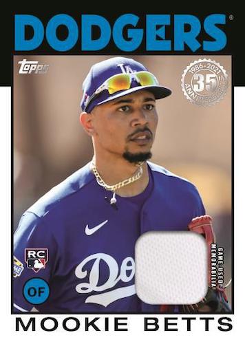
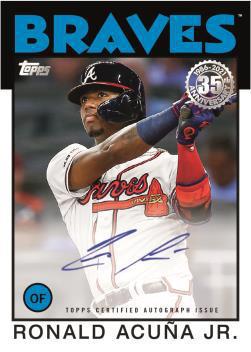
 Looks like those parallelograms on every base card will be the same colors and not in team colors. Below is a mockup of a a Memorial Day parallel and either a 1/1 Platinum parallel or a #/70 Platinum Anniversary parallel:
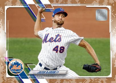


")