
Random Card of the Day |
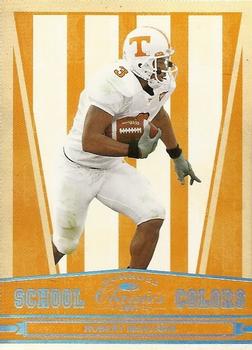
Tuesday, January 4, 2022Year: 2007 Set: Donruss Classics - School Colors (Rate) “ Decent pro career, a nice college insert. ” -muskie027
1
“ The chrome on the front is hard to read in contrast with the yellow. The back needs some more detail too. Overall a cool design though, I like that they used the school colors. ” -pugchump
1
“ That is an overabundance of orange. ” -rmpaq5
9
“ Even though I don't like College card sets, I do tend to like some of these School Colors inserts. ” -captkirk42
1
“ That's one ugly design! ” -BigDaddy
2
“ Neat concept, wish there was a card for my school. ” -jackal726
1
“ For those in Montreal, Il est horrible. ” -NJDevils
2
“ I get that Tennessee's colors are white and a horrible shade of orangey-yellow, but really? The card is ugly. No way around this one. ” -BigBoyOnWheels
1
“ This is an ok design. There is not much information on the back. ” -Brendan Barrick
“ I was surprised he never turned out to be a better NFL player. He flopped. ” -tinyshogun
1
|
Additional Comments
| Posted By | Message | ||||
|
Joined: Apr 2014 |
| ||||
|
Posts: 4 Joined: Oct 2015 |
| ||||
|
Joined: Jun 2020 |
| ||||


")