Wednesday, February 17, 2021
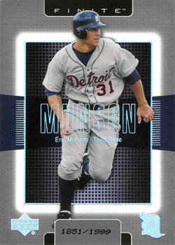
Year: 2003
Set: Upper Deck Finite (Rate)
Card: #39 Eric Munson
“ They used the same design in the NBA, but instead of holofoil for the name and logos, they used standard silver foil. The baseball version looks much better.
Every card in the set is serially numbered. ” -Billy Kingsley
“ “Without me these kids would have been Munsoned” ” -BrewerAndy
5
“ Yay one of my Tiger's scans is finally picked up as COTD! Look modern card makers...a different photo on the back! The name placement is kinda weird, it's like they are trying to go for the look of the trailer of an upcoming action movie starring "Munson." ” -rmpaq5
6
“ The beginning of the weird SN at the bottom of these cards. Great looking card, too bad his career got Munson'ed. ” -parsley24
“ It's as though someone created a background that has nothing to do with baseball and then slopped a player's picture on top of it. Totally incongruous. ” -NJDevils
“ OK if you want that film slide look. Hard to read his name, that light blue font must be foil. ” -captkirk42
“ I really dont like to have to focus my eyes in that area, to read his name. Maybe the worst set design I've ever seen. ” -switzr1
“ I'm actually digging this design even though it reminds me of a back-lit processor on a motherboard. ” -Madden95


")
.jpg)