Friday, February 2, 2018
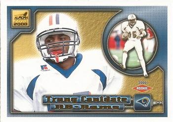
Year: 2000
Set: Pacific Aurora (Rate)
Card: #117 Trung Canidate
“ Unique design. Not sure if I like it or not. Is the background gold metallic? That would be cool if it was. ” -Billy Kingsley
“ It looks like he has a little "devil" Trung on his left shoulder trying to convince him to do something bad. At least it doesn't fall into the same picture on back trap. ” -rmpaq5
“ Odd design. I don't mind it, but I don't love it. And that's a name I haven't heard in about 18 years. Totally forgot he existed. ” -switzr1
“ Pacific was hot in the early 2000's. ” -carthage44
“ I really like this card. Everything about it I like. I wish the baseball version was the same since I don't collect football. ” -davidhandberry
“ Interesting design. ” -Sportzcommish
“ A great option on madden '00. An ok looking card for pacific. ” -parsley24
“ As a Rams fan and having the Rams as one of my teams in a Team Traders group (along with my Homie Redskins), I have a couple or more of this card. At one point Trung was the only card I had from this set so I was starting to think he was the only Ram in it. Recently I got someone like Isaac Bruce or Marshall Faulk in a trade. For the record there are 5 Rams listed in the set and 5 Redskins, seems that each team does have 5 cards in the set, oops some have only 4 some have six. I sort of like this overall design but I am not a fan of photos on the back and the back only has one year of stats (for all the players not just these rookies). Also not a huge fan of lanscaped card fronts. ” -captkirk42
“ Though I'm sure this joke will be made several times - Candidate for what? Very late-90's/2000 design going on here. Not terrible for a card of a kid coming out of college. Pacific gonna Pacific. ” -marcbrubaker
“ Sorry if you disagree, but for me this font is a horrible choice. It's just not that easy to read and becomes a distraction. The layout of the back looks like two piers sticking out into a lake. I guess I don't get it. ” -kents_stuff
“ I get the feeling that this may not be the consensus for various reasons, but Pacific brand cards were and are some of my favorite cards. I like cards that are a little more artistic without drowning out the actual player on the card. This card is a good example of that. The graphics are nice on the front and the back; you get two clear different photos of the player on the front; and his name, team and team logo all stand out (I hate having to squint and search to try and find a players name on the front of a card). The back is consistent with the front design but possibly could have given a little more info. Compared to some of the sets from other top brand cards around the same era, Pacific really stood out. ” -Bukero
“ Truly one of the most unique names every printed on a sports card. In terms of this card, it's a classic gaudy Pacific design from the early '00s. In other words, I love it! ” -mkaz80
“ I'm on the fence with this one. Unique front design. I do like the sepia background on the back photo. I don't like the insert photo on the front though. A lot to think about....except for quality stats. I don't like single year stats. ” -cnangle
“ Not bad. I kind of like it. ” -muskie027


")
