Random Card of the Day
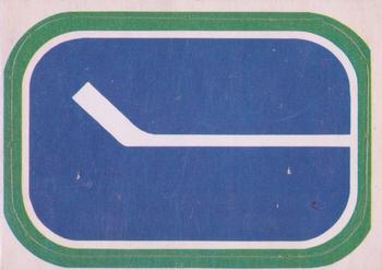


Sunday, July 23, 2017

Year: 1972-73

Set: O-Pee-Chee - Team Logos (Rate)

Card: #NNO Vancouver Canucks


“ This logo is awesome! ” -carthage44

“ Not a bad sticker for an album. Was this a card in the set or on a box? Is it a sticker? Were these inserts? These pre-date me and I don't know much about this set. Hockey is funny in that I feel like everyone thinks every team should wear the jerseys and use the uniforms from when they started watching. There is something special about the teams and logos from when you first enter following it. That being said, I love the Canucks black and yellow/orange logos and uniforms from the 80's/90's! ” -muskie027

“ No comment ” -Quinn820

“ Maybe some people like this 'classic' logo, but it doesn't do a thing for me. Looks more like a street sign. ” -mkaz80

“ I love team logo cards. I love all team cards but team logo cards are perhaps my favorite. This one appears to be a sticker. No matter, I want them for my collection. ” -Billy Kingsley

“ I wonder what a scratch and sniff hockey sticker would smell like. ” -DanD

“ Not much of a hockey man, but this is pretty cool. Almost looks like a whale head or something. ” -RoyalChief

“ Wow, an "In Action" shot. ” -cjjt

“ Love it....why not. Old school.....simple....and cannot offend anyone. ” -tbshaw

“ Simple, but cool! ” -bkklaos

“ The ultra-minimalist Canucks logo.. ” -Mike67

“ Cool Hockey team logo sticker. Oh and it's OPC too. Extra Cool. ” -captkirk42


Additional Comments

Posted ByMessage

C2Cigars

Posts: 11467
Joined: Oct 2014
Sunday, July 23, 2017 12:08 AM

Sounds like many don't realize that the logo is actually a stylized letter "C".


-------------------------------

Someday my cards may double in value and then be worth half of what I paid for them.


Billy Kingsley

Posts: 7512
Joined: Aug 2011
Sunday, July 23, 2017 12:22 AM

Most early inserts were one per pack. I have not learned enough about hockey cards yet to know if that is the case here though. I suspect it is.

Not only is it a C, it's also a rink and a hockey stick. Actually quite clever. I still like the Flying V they replaced it with more though.


-------------------------------

VERY slow trading due to health problems. Not transferrable so safe to trade with, just moving is painful and can't always access the cards. 

Cardboard History  My COMC

New Collection Website: Cardboard History Gallery  (Still under construction)

Tips on how to make your scans look like the card does in hand (No more washed out, fuzzy scans!):


muskie027

Posts: 692
Joined: Apr 2016
Sunday, July 23, 2017 12:41 AM

This is why I love the site.  I earn things all the time.  I never knew about the C.  Now I see it clear as day.


bkklaos

Posts: 83
Joined: Dec 2012
Sunday, July 23, 2017 7:53 AM

Ditto what "muskie027"...the hockey stick was obvious to me, but didn't catch the stylized "C" or the rink!  Definitely ups my "simple, but cool" to "way cool"!


DarkSide830

Posts: 227
Joined: Sep 2015
Sunday, July 23, 2017 9:34 AM

Cool, my favorite player!


Billy Kingsley

Posts: 7512
Joined: Aug 2011
Sunday, July 23, 2017 12:07 PM

To be totally honest, I probably wouldn't have noticed the double/triple meaning if I hadn't read the history of each NHL team on Wikipedia earlier this year. They detailed it on there.


-------------------------------

VERY slow trading due to health problems. Not transferrable so safe to trade with, just moving is painful and can't always access the cards. 

Cardboard History  My COMC

New Collection Website: Cardboard History Gallery  (Still under construction)

Tips on how to make your scans look like the card does in hand (No more washed out, fuzzy scans!):


jonnic

Posts: 15
Joined: Feb 2015
Sunday, July 23, 2017 12:29 PM

Parallel dimension of a skating rink ?  The 'C' is blue instead of white. Nothing else to add.


avsbruins65

Posts: 2146
Joined: Sep 2008
Sunday, July 23, 2017 12:43 PM

Some vintage hockey love. Nice to see a variety recently


-------------------------------

Trying to acquire one card for every for every set, insert, parralle, minor, euro, team issue, oddball etc sets produced for Hockey. Been an interesting project.


captkirk42

Posts: 2269
Joined: May 2011
Sunday, July 23, 2017 2:50 PM

If I recall correctly the team logo stickers (Topps and OPC) were inserts to the regular hockey card set that year. Included in the regular packs 1 per. According to this DB they were inserted 1 per pack in the 3rd series. http://www.tradingcarddb.com/Inserts.cfm/sid/4832/1972-73-O-Pee-Chee


-------------------------------

I collect: Baseball, Football, Hockey, Mostly Vintage pre1980, My Homie teams - Washington/Baltimore Teams Senators (Twins, Rangers), Expos/Nationals, Redskins, Capitals, Bullets/Wizards - HOFers - Non-sport (mostly TV shows and movies).

My Trade List is very much a work in progress

CaptKirk42s Trading Card Blog Curly W Cards Strive For '65 YouTube klandersen42


C2Cigars

Posts: 11467
Joined: Oct 2014
Sunday, July 23, 2017 5:00 PM

The "white ice" version was worn on their home jersey.

No automatic alt text available.

jonnic wrote:

Parallel dimension of a skating rink ?  The 'C' is blue instead of white. Nothing else to add.


-------------------------------

Someday my cards may double in value and then be worth half of what I paid for them.


Log in or register to continue.


Copyright © 2024 Trading Card Database LLC
Designated trademarks and brands are the property of their respective owners.