Random Card of the Day
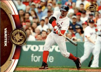


Tuesday, May 24, 2022

Year: 2006

Set: Upper Deck Sweet Spot Update (Rate)

Card: #14 Jason Varitek


“ Nice looking card. ” -BigDaddy
  3
“ The name being sideways is w i e r d. ” -parsley24
  3
“ I hate cards like this with the name and the photo oriented differently. They don't look right either horizontally or vertically. This one is particularly bad because that photo could have easily been cropped differently and not lost anything of significance. ” -hiflew
  5
“ OK design, just don't like how they handled these landscaped oriented cards. ” -captkirk42

“ This reminds me of a picture of my daughter that I'd post on FB and her hitting coach would pick it apart at her next lesson. "Where are your eyes? Look at that front foot... why is the barrel a foot below your hands?" ” -jackal726

“ Nice photo, but I've always found it annoying when the orientation of the front and back of a card are different. They probably could have rotated this photo and made everything vertical. ” -Musclebeech
  1
“ One of my favorite players of all time. Cool card design too. ” -pugchump
  1
“ other than being horizonal, there is nothing i dislike about this card design ” -Thunderfoot


Additional Comments

Posted ByMessage

Onemorepoint

Posts: 1446
Joined: Apr 2014
Tuesday, May 24, 2022 5:14 AM

Not a fan of horizontal cards but they made a good attempt at trying to make it work.


ivywalls

Posts: 5
Joined: Jan 2014
Tuesday, May 24, 2022 5:16 AM

I like horizontal cards because to me it feels more natural, but the name being sideways just throws it off the plate and i get get into that kind of pitch !!


lyfestory

Posts: 115
Joined: Jun 2013
Tuesday, May 24, 2022 9:03 AM

Never been a fan of sideways pictures, particularly when stored in a binder. I guess its ok if the whole 9 card page is sideways, but ive really liked them. I dont think they really started being prominent until 1991 pretty much. I know there were some in vintage cards but they basically disappeared for a long while until around 1991. 


Mr Riggy

Posts: 379
Joined: Jul 2020
Tuesday, May 24, 2022 10:56 PM

The entire name/logo section of the front looks off to me. The horizontal picture and the vertical name, the team logo and all of that brown. The player should be larger and is that his regular swing?


-------------------------------

-Rick ⚾⚾⚾⚾⚾


Log in or register to continue.


Copyright © 2024 Trading Card Database LLC
Designated trademarks and brands are the property of their respective owners.