
Random Card of the Day |
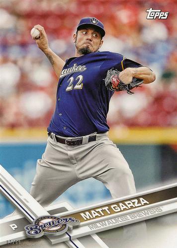
Friday, October 23, 2020Year: 2017 Set: Topps Milwaukee Brewers 5x7 (Rate) “ Matt Garza is the worst. That’s all. ” -BrewerAndy
“ Late 20Teens Topps sets tend to all look alike after awhile. Oh this is 2017 wasn't sure thought it might have been 2016 for a while there. Another observation, what is going on whith Matt's pants there? Looks like he wanted to wear parachute pants but MLB rules wouldn't allow him so he got a pair of pants 3 sizes too big. ” -captkirk42
“ Never like the Maginot Line design at bottom front. ” -NJDevils
“ the 2017 Topps design feature at the bottom takes up too much of the card, not a fan. And not a fan of box toppers / jumbo cards; if it doesn't fit in a shoe box standing up in a row, I don't want it in my collection. ” -abide
“ Topps should not recycle the images between their base set and their team sets. They would be much more interesting that way. ” -DarkSide830
“ Not sure what the design is. Maybe I just don't get it. Not bad. I think the name and team "bar" would of been suffice. ” -Phil
“ A touch newer than what I have in the collection, so first time really seeing this design. Not sure if it's the same as the regular Topps that year or not. I like the use of the angled design and text more than I do in the '94 Topps Baseball (I think '94..'94ish, at least). But I think it does a dis-service to the team logo. I don't know...maybe it looks cool with some logos--a bit of a 3D effect I guess. Anyways, overall a decent design for a card IMO. ” -kents_stuff
“ What are these 5x7 cards? I've never seen one before. Anyway, good to see Topps represented in RCOTD! ” -Soarin22
|
Additional Comments
| Posted By | Message | ||||
|
Joined: Feb 2020 |
| ||||
|
Joined: Apr 2014 |
| ||||


")