
Random Card of the Day |
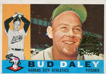
Thursday, August 20, 2020Year: 2009 Set: Topps Heritage - 50th Anniversary Buybacks (Rate) “ I like Buybacks. Wish they were more prevalent in my collecting areas. It would be nice to be able to add something new from an otherwise completed set. ” -Billy Kingsley
“ There's a 420 joke in there somewhere for someone that partakes of buds daily. ” -jackal726
“ As a kid, I loved the 1960 Topps, especially the backs where they gave you the highlights of the players good days. ” -NJDevils
“ Horizontal design. Incomplete stats. Color scheme doesn't match team colors. Topps really needs to get back to the basics. These modern Topps designs are all awful. ” -switzr1
“ Some people want a "Bud" daily, others want a Bud Daley. It's all good. ” -bpaul14
“ AH COME ON MAN RCotD! I was super stoked I was seeing a real vintage card, then I saw the title of the card "2009 Topps HERITAGE.." WHHHHHAAAAAAAT. A dang BUYBACK! Yep it's got the condition ruining 50th Anniversary Stamp. I LOVE real vintage cards I like Heritage retro cards that pay homage to the cards, I DO NOT LIKE when a real vintage card is defaced with a stamp to make it a BUYBACK. OK maybe one day for some of these sets a buyback maybe the only affordable copy of a card I can find, but still UGH. ” -captkirk42
“ Well who doesn't love a Daley Bud? Every morning there's a halo hangin' from the corner of my girlfriend's four-post bed. ” -ganondorf666
“ I love the pre-1970s baseball card designs, especially this one. ” -BasketbalHQ
“ I like getting the old cards in packs. Not quite sure how I like the "buyback" stamp. They should all try this maybe....Donruss.....you need to buyback some 88-90's??? ” -Gator415
“ I am not a fan of buybacks. Buybacks reduce the supply of original cards in the marketplace. ” -Brendan Barrick
“ Now, that's a baseball card! I don't like the addition of the foil, though. ” -jayoneill
“ I'm not a fan of re-prints, but let's talk about the original card. Cons: the plain background on left with the live background on the right is a bit awkward to me. Just a single year's stats on the back. Pros: An action photo (okay...it's posed, but still) PLUS a head-shot. I always thought the dual color lettering worked on these cards. Perhaps one of Topps' best ever "card number in a baseball" efforts. And most of all not only do you get a cartoon on the back but also a team mascot on the front! A real winner from my perspective. ” -kents_stuff
“ Looks like a nice card. 2 pictures on the front is kinda nice. ” -dollar guy
|


")