
Random Card of the Day |
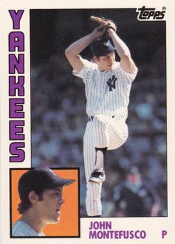
Friday, June 26, 2020Year: 1984 Set: Topps - Collector's Edition (Tiffany) (Rate) “ One of my favorite Topps designs and a Yankee to boot! I like the blue back as well. Great card! ” -muskie027
“ Nice shot of "The Count" in mid-windup. Hard to think of him as a Yankee after such a brilliant start to his career with the Giants. ” -bpaul14
“ Cool a real 1984 Topps and not a modern Archives version. ” -captkirk42
“ For some reason, it immediately made me think of the 1981 Donruss set. I don't really know why, but maybe it's because the card does not look like a Topps card but something that Donruss would have produced. It's not a bad-looking card, but it's very boring. Technically, it checks all the boxes, but overall, it seems very bland and unexciting. ” -georgecf
“ I love 1984 just a classic design. I would have been 6 but this collection has always just spoke to me as a classic design. sadly everything went downhill for awhile after this. ” -parsley24
“ I like the regular Topps set. i am not a big fan of the Tiffany issues. ” -Brendan Barrick
“ Can 1984 Topps Tiffany be considered the first parallel/unnecessary set? Although I must admit that in this case the white glossy cardboard was likely a big upgrade from the standard grayish cardboard. ” -vanstryland
“ Two pictures on the front, that is interesting. But not something I would collect if I was a baseball collector. ” -dollar guy
“ The 84 design is still, imo, the most recognizable set from the 80s. Love the design and "Donnie Baseball" made this set. The 84 traded is a sweet set also. Tiffany variation are beautiful cards. Twice the gloss as Fleer Glossy. ” -CardFlipper1974
“ Montefusco beats Buttafuoco any day of the week, and twice so on a Jay Leno monologue. All kidding aside, it is a nice card, with a portrait and action shot on front. Back is well balanced with color and border style. ” -CollectingAfterDeath
|


")