
Random Card of the Day |
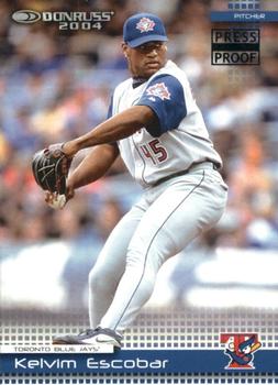
Friday, July 5, 2019Year: 2004 Set: Donruss - Press Proofs Black (Rate) “ Nice low number parallel. Pretty solid design too. The text is a little tough to read but not impossible. ” -Billy Kingsley
“ Nice looking front, good looking back. Then I saw the numbers and it my estimation of this set sunk. I hate when there are so few of a card. I miss the days when you could presumably get all cards of your favorite player or team. Now with 1/1 or even 1/10s there is no way unless there are less than 10 Blue Jays collectors. ” -davidhandberry
“ Press Proof parallels go back to 2004? I didn't know. Nice looking card. ” -muskie027
“ So glad the Blue Jays went back to their uniform style from their World Series years. Really not a fan of the space-like font on the back of the card. ” -vanstryland
“ Nice looking card, though I don't feel the tiny Press Proof in the corner really adds anything to it. ” -switzr1
“ I love the old Toronto blue jays logo ” -Thomas555
|
Additional Comments
| Posted By | Message | ||||
|
Joined: May 2011 |
| ||||

")