
Random Card of the Day |
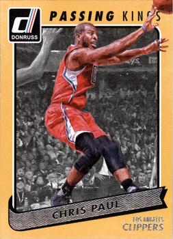
Wednesday, April 3, 2019Year: 2015-16 Set: Donruss - Passing Kings (Rate) “ I like the various Kings inserts that year, They had a cool texture to them. ” -Billy Kingsley
“ There used to be a captioning thing for cards in Beckett back in the 90's when I had a subscription. This card is screaming to be captioned. He looks so frightened of the ball. There are so many things wrong with this card that I don't even want to start and just give it 0's all around. ” -davidhandberry
“ I like this set. I opened a lot of Donruss that year. ” -switzr1
“ Not a bad looking card. This was (is) my favorite Donruss logo. Also, I'm surprised to learn that I'm taller than Chris Paul. ” -DocOso
“ I like that he may actually be passing in the pic. Not a bad photo. ” -parsley24
“ I like the front, the back eh good thing this is an insert set. Dang need to get the John Wall for my Wizards PC. ” -captkirk42
“ Front is pretty decent, good contrast. Back is poor. Please do not use half the card to tell me his height and weight. You, I just noticed that if reversed the pronunciation of "height" and "weight", you would get "hate" and "wite" ” -NJDevils
“ I'll pass. ” -jayoneill
“ The various inserts in the 15-16 Donruss set aren't bad. I just wish there weren't so many. I like the various "Kings" inserts though and this one looks as nice as the rest. ” -muskie027
“ Not a bad looking insert. His hands and ball outside the frame in front of the letters at the top is a bit annoying but not overly so. ” -rmpaq5
|
Additional Comments
| Posted By | Message | ||||
|
Joined: Dec 2014 |
| ||||
|
Joined: Nov 2017 |
| ||||
|
Joined: Jun 2017 |
| ||||


")