
Random Card of the Day |
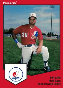
Tuesday, June 26, 2018Year: 1989 Set: ProCards Minor League Team Sets (Rate) “ So his shirt has the full Montreal Expos log, but the hat and card logo cut out the blue b? Looking at other examples for the team on line this is the norm. The colour combination of the border with the uniform really stand out. And who can argue with Kool Aid man making an appearance on the back! Oh YAAAAAA! ” -rmpaq5
“ I don't know why I love minor league cards so much. I try to pick up as many Braves minor leaguers as I can. ” -davidhandberry
“ Expos please come back! ” -carthage44
“ This card is awesome in so many ways! The logo is odd looking without the blue portion (despite the usual version appearing on the jersey) ” -dilemma19
“ Weekly Minor League Baseball. And we have an Expo. The team has a pretty long history being affiliated with many MLB teams over the years. They were mostly known as the Jacksonville Suns, when affiliated with Montreal from 1984-90 they were the Jacksonville Expos, after 1990 they returned to being the Suns. They have been affiliated with the Marlins since 2009 and as of Nov 2016 became known as the Jacksonville Jumbo Shrimp. My my minor league baseball gets mighty confusing. ” -captkirk42
“ Hell yes old-school ProCards. This is a perfect design. Love the red border, I think I've only seen these in the light blue so far. Really dig the subtle adaptation of the Expos logo to reflect the Jacksonville location, too. ” -marcbrubaker
“ Nice Kool-Aid colored card! ” -suomibear8
“ Hey, Kool-Aid!! Oh, yeah! At first I thought the logo was not outlined well and off-center. But recognizing it's the Jacksonville Expos, the "J" makes sense. But then the uni logo doesn't. ” -kents_stuff
“ Ohhh yeahhh! ” -UKboogie
“ I thought there was something wrong with the Expos logo, then I saw his hat is the same. Odd. Standard ProCard, not used to the red. ” -muskie027
“ Never seen a red border ProCards before, very nice. Kool-Aid? OH YEAH! I would totally drink Kool-Aid again if they had cards with them. Not sure how they would package them though unless it was a mail in deal. ” -jupiterhill
|
Additional Comments
| Posted By | Message | ||||
|
Joined: Jan 2015 |
| ||||
|
Joined: Jul 2011 |
| ||||
|
Joined: Apr 2017 |
| ||||


")