
Random Card of the Day |
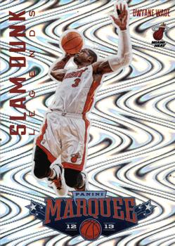
Friday, May 25, 2018Year: 2012-13 Set: Panini Marquee - Slam Dunk Legends (Rate) “ No. Just no ” -Splinter_9
“ Not really a fan of the psychedelic front. I much prefer the back of the card. At least it's a Panini card that has team logos on it. Better than any of their baseball issues. ” -Lerxst2112
“ These look so cool in hand...the scans don't do them justice. Multiple layers of holographic foil make it a rainbow in hand. I'm glad Dwyane got traded back to the Heat this season. His playing for other teams...and the way it went down...was so wrong. ” -Billy Kingsley
“ It hurts my eyes, make it stop. ” -CluelessJoe
“ So wavy. ” -carthage44
“ Oh my God I have Vertigo! ” -rmpaq5
“ Woah. Looks like a 90's Skybox card! ” -olerud363
“ not a good back ground if you are epileptic. and then using the same photo for front and back. Boo. ” -parsley24
“ Crazy front what are they trying to do a Topps Matrix er TEK? Hard to see the guys name and then to find out it is a big star for the Heat. Back is much better. If the card didn't have the front it would look like an homage to the 1960s Post Cereal and Jello cards. ” -captkirk42
“ That 70's Show ” -wjhipwell
“ Who designed this? Sid and Marty Krofft ? ” -altaeria
“ When I see cards designed like this I am forced to wonder... How many drugs where used in the making of this? ” -YoRicha
“ Whoa! Wavy and psychedelic. Far out man. I think that is that guy named Marguee and it looks like a giant Knicks logo. I mean, wait, his name is Panini. No, it is what? Not Slam. Not Dunk. Not Legends. I think that is a 3. Oh wait, my microscope found it. It is Dwayne Wade for the heat!!!! ” -muskie027
“ A little too psychedelic for me. ” -rmitchell6700
“ I don’t know. This card looks tacky and over complicated but if I pulled it, I would probably put it in a sleeve ” -Bargunmaster
|

")