
Random Card of the Day |
Wednesday, October 16, 2013Year: 1994-95 Set: O-Pee-Chee Premier (Rate) “ Front design is great. Black border on the back, ugh! All in all, this is nice looking card. ” -vrooomed
“ This could be the most boring hockey card I've seen. No action, not a good portrait, blah. ” -marcbrubaker
“ Another great design on a mid 90s Hockey card. ” -Billy Kingsley
“ One of my all time favourite Canadiens.I like this set better than previous years,it's brighter & better looking. ” -uncaian
“ The front design is slick and minimal. It does everything right, and, while unoriginal, is a nice, solid design. The back is a mid-90s mess. ” -Luckynumber78
“ is it me or is the back of the card rough on the eyes? ” -NJDevils
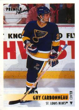
“ I didn't really like these Blues uniforms because the crest has a small "St. Louis" in the top. Seems a little unnecessary. ” -jlaz10
“ I am sorry for the Star Trek cards!!! OK? SORRY!!! At least it's not Pokemon or Yu-Gi-Oh! cards... At least be thankful for that. (No, I will NOT add those. Someone else can do that.) Oh, HEEEeeeyyy... A Hockey Card!! I didn't know he played for the Blues... Always thought he stuck with Montreal. ” -Dixxy
|

")