Random Card of the Day
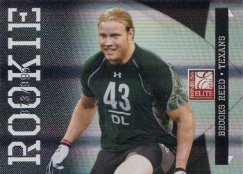


Sunday, March 11, 2012

Set: 2011 Donruss Elite (Rate)

Card: #113 Brooks Reed


“ Took me a minute to realize this was football. Was thinking he looked like a thuggish soccer player. ” -wmcduff
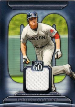

Saturday, March 10, 2012

Set: 2011 Topps - Topps 60 Relics (Rate)

Card: #T60R-JE Jacoby Ellsbury


“ They're kinda over-doing it with the patches, especially with the non-big time players. ” -Tony
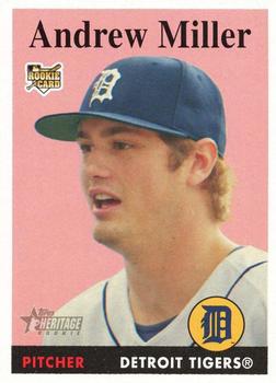

Friday, March 9, 2012

Set: 2007 Topps Heritage (Rate)

Card: #206 Andrew Miller


“ Looks like a pre school set with the primary pink color and tinted cheek hues. Whats with the want to recreate the older cards with today's players. Simply stop it! ” -addysdaddy

“ I don't know if it's the angle or the card style, but Miller looks like he has a block head.. ” -Mike67

“ pink? really? nothing else to say..and Miller is like 'Awwww' ” -Tony

"Andrew Miller was supposed to be what Justin Verlander has become. It looks like Andrew is trying to convince someone that pink is just not the ideal background color for him." -Scott Sawyer
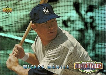

Thursday, March 8, 2012

Set: 2010 Topps (Rate)

Card: #250 Mark Teixeira


“ Almost looks like Mark's swung with so much force it's sending out a shockwave.. ” -Mike67

“ I'm so using that move next time I'm on a dance floor. Woo! ” -wmcduff

“ I wonder what team 'Tex' plays for, the log is almost too small. ” -addysdaddy


Wednesday, March 7, 2012

Set: 2008 Topps (Rate)

Card: #291 Eugenio Velez


“ I still don't like the 70s Vegas letters in circles thing. It's ugly. ” -wmcduff

“ don't like the giant gumballs on top and didn't he get the memo about a 'signature'- looks like a 3rd grader printed that. ” -Tony


Tuesday, March 6, 2012

Set: 1964 Topps (Rate)

Card: #67 Detroit Tigers


“ The original photo shopped pictures! ” -addysdaddy

“ Was there ever a time when people got fired up over team cards? Some poor shlub missed out on a chance to get a card of his own because Topps felt the need to float the 1963 Detroit Tigers in a yellow sea, where few can make out individual faces. The modern team cards are even more absurd, because some Photoshopper at Topps has to reposition players and walls to hide uncontracted bat boys and traveling secretaries. ” -Dave Sosidka

“ Now that is a nice card. I am surprised the Tigers logo wasn't used. ” -NJDevils

“ OK, folks, I'd like to talk to you about framing and white space. This, to the left, is an example of what not to do. ” -wmcduff


Monday, March 5, 2012

Set: 1994 Leaf (Rate)

Card: #49 Al Martin


“ My favorite two-sport athlete. He was great at USC, playing in that secondary. ” -jimmyjam


Sunday, March 4, 2012

Set: 1994 Upper Deck - Mickey Mantle's Long Shots (Rate)

Card: #MM21 Mickey Mantle


"blahhhhhhhhhhhhhhhhhhhhhhhhhhhhh hhhhhhhhhhhhhhhhhhhhhhhhhhhhhhhhh hhhhh" -nicolas
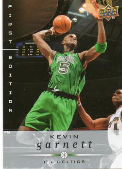


Saturday, March 3, 2012

Set: 1991 Studio (Rate)

Card: #145 Tom Glavine


"The headshot that Tom sent to the studio in his attempt to audition for Dazed and Confused." -Scott Sawyer

“ Look at that feathered do! ” -addysdaddy

“ never liked these cards, it’s like their going for a modeling job. Tom's posing like he's auditioning for some lame old tv show like Knotts Landing or something. ” -Tony

“ I suppose Leaf/Donruss thought the 1991 Studio cards were artsy at the time. Some of their subsequent Studio issues were much nicer, and yes, in color. ” -Dave Sosidka

“ It's weird.. I liked the Studio sets, but they also bothered me.. Maybe it's the guys looking like they're trying to be models.. ” -Mike67

"1991 Studio. What a boring set" -Matt

“ You'd think a studio shoot would involve eliminating hat hair. ” -DanD


Friday, March 2, 2012

Set: 2008-09 Upper Deck First Edition (Rate)

Card: #10 Kevin Garnett


“ That's one big lepraucan!!!! ” -cynicalbuddha

"KG swats the UD logo away and goes in for the dunk" -Matt

"Just like Topps Opening Day, Upper Deck First Edition is just pointless." -Scott Sawyer

Page:


Copyright © 2024 Trading Card Database LLC
Designated trademarks and brands are the property of their respective owners.